
For my instructional illustration I am going to design a recipe informing people as to how to make a candy-floss pavlova. I chose this particular food as I feel it is quite crazy, as takes a stereotypical pavlova, and uses a slightly more un common combination (seen through adding candy-floss to the top). I intend to produce a Wacom drawing in Photoshop, and then perhaps develop it further by using scanned in media.
Starting my Illustration
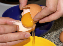
Using Google images, I found a picture of two eggs which I planned to draw as the first step of my instructional illustration. Despite my recipe involving four eggs, I decided to start with two, and later draw more, or explain within my recipe that more than two is needed. 
The three photos below show the process I took when drawing out the first egg. Using the eyedropper tool, I selected different areas of the egg and drew them over the top of the image. This was in an attempt to get the most accurate colours to use as the egg. Then, using the Mixer Brush Tool, I mixed the colours together as smoothly as I could to get them as close to the actual appearance of the egg as I could. At this point I felt my egg was done, but comparing it to the image, it seemed considerably different. Once taking a closer look at the photo, I realised that the egg was speckled, and therefore did not have as smooth an appearance as I had assumed. To add the speckles, I used brush number 66, (located in the brush panel), and used it to create this dotted effect. Now I have completed one egg, I intend to go on to working on the next one.


When deciding how to produce my second egg, I realised that I could save a lot of time by duplicating the first one I had drawn, and by shading, make it look like a second egg. I also decided to make my design differ from the original photo slightly, by putting the eggs closer together and then placing the shading in the centre, below them. The reason for putting the eggs so close together was due to feeling they appeared more like they were floating with the gap between them in my illustration. I therefore felt that my design was stronger if they were not parted.
Overall, I am not that happy with the eggs I have drawn and despite trying to make them look quite real, I feel that they’re strange shape and the shading is unrealistic. If I have time, I may come back to develop them further because of this. 
Now I am onto the next part of the illustration, where I am going to draw another egg (this time cracked open) to show the idea that the egg yolk must be parted from the egg whites. Without showing, or explaining this, the recipe could go quite wrong. The picture below I found on Google images, and intend to draw to show this process.
Using the same process as what I used to draw the first lot of eggs, I have started to work on the next egg illustration.


To put a speckled effect on my egg, I used a brush tool that allowed me to create a spotted effect. This made this part of the design a lot easier to complete as it speeded up the process of adding the dots individually. 

Once completing this illustration I placed it next to the other eggs I had drawn. By themselves, I feel as though the eggs look as if they are floating in mid air. Therefore, in my further design process I am planning to put the eggs in some kind of box, giving the illustration more of a structure to it.
(above picture found on Google images)
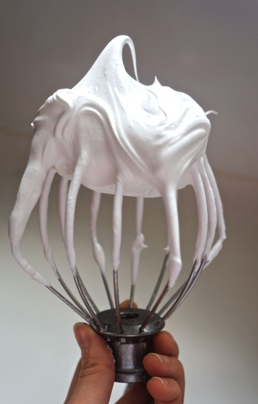
I am going to copy this image of a whisk head, as it shows the effect of mixing eggs until they are light and fluffy. This is something which is part of my recipe, and therefore I felt the need to show this through my illustration. I feel that this is going to be very time consuming and tricky to draw, as it is multiple shades of white, which means I will have to be very accurate with my colour placement.


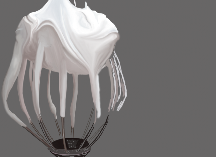
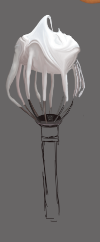
I started off this illustration process by outlining areas of the egg white mix, and then filling in sections using the brush tool, and colour mixer tool to blend the colours together. At this stage I am happy with how this illustration is progressing as I am finding it very time consuming, and incredibly difficult to draw. This is due to the amount of detail I am having to put in it, to make it as realistic as the picture. I am using a photograph from google to copy as I found this to be of a better quality than the photograph I took of this process.

I am incredibly happy with how this element of my design has turned out. However, as I have been focusing on it for so long, it is becoming tiring and I feel if I do not move onto another part of the design soon, I won’t be able to complete the illustration as a whole piece.

(picture above found on Google images)
Due to being bored of working on the egg white mix, shown on the whisk, I have decided to start working on another part of my design, which is the Pavlova itself. As it is another item which is purely different shades of a white colour, I feel that this illustration will be equally as as hard due to this factor.

I have started the process of drawing the pavlova by using the brush tool and marking out the colours in the pavlova, and then blending them in further with the colour mixer tool. The colour mixer too is something I have used a lot in my design process so far, and feel it is a tool that works well for me. However, sometimes I do find it tricky to use, as when blending two colours together, it tends to make one colour come out a lot stronger than the other. This is something I have had to overcome by continuing to work over the areas I have blended together.


Now I have finished my pavlova, I am extremely happy with the outcome. It was incredibly time consuming to produce however, and I have therefore lost a lot of time on my other illustrations.

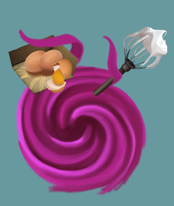
Above is a screenshot of my three different Wacom drawings. Zooming out and looking at them like this makes me realize how much more is needed on my instructional illusion, as I have spent a lot of time so on it so far and it is not crazy, or purposeful yet, so does not fit the brief at all.
I have decided to work back into my egg illustration, by giving it less of a ‘floating’ effect. To do this, I have taken a picture of a cardboard box, and placed it beneath the eggs drawing. 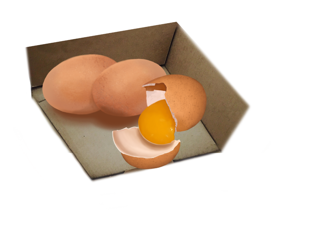
I have then reconstructed the box and using the rubber tool, rubbed out the areas that I didn’t need. However, I found it difficult to give the box straight edges, and therefore used rectangular shapes (coloured white) to place over the top of the box, giving it straight edges.


Here I have experimented with two different types of text, to go alongside my illustration. I feel that the second example of typography I have used is the most successful, as it is a lot clearer to read than the hand drawn typography.

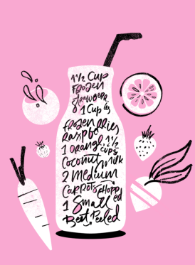
Above is a recipe that I am particularly fond of due to its composition, and is something I am hoping to base my work around due to the successes of how its composed. I am fond of the circular shape in the centre of the illustration, and like how the recipe is based around this. I am therefore hoping that I will be able to use a circular shape to base my work around, and bring out this ‘craziness’ which is in the brief, as I feel it is a different composition to the normal recipe style.

Above is an image, taken from google images, and is the image I am hoping to draw a copy of to base my recipe around. I m hoping to change its colour, and feel that this will then resemble a pavlova further, and will be effective for my recipe composition and structure.


On the left of my swirl illustration is the photograph I am copying. I changed the colour using the ‘photo filter’ tool. As I applied one layer of pink to the photo, I found that it was still slightly brown, and therefore had to use this tool three times in order to change it to the bright pink colour I intended to have. This is an obstacle I had to overcome, as I do not know another way I could change the colour of the photograph, and therefore had to rely on using the Photo Filter tool multiple times to achieve a pink effect.

I have started to develop my swirl illustration further, and am quite pleased with how it is turning out. However, I have found it quite tricky to produce as I was hoping to get it as close to the picture of possible, but feel despite it being close, this desired effect was not achieved.

Now I have completed the swirl part of my design, I have placed it in the center of my recipe illustrations, and have placed these over the top of it, pushing the swirl into the foreground. I felt it was important to keep the swirl in the center of the recipe design in order to achieve this circular effect I was aiming for, based upon the apple cider recipe illustration I had previously looked at. Placing it in the center of the recipe is something I am hoping to seem quite effective in my design work, as I feel the spiral sense it has will hopefully draw the readers eyes around the recipe.
I chose to make this part of my illustration pink as i felt this would bring my illustration to life, and eliminate the boring sense it had to it. I am hoping to make my recipe appear fun, which will make it stand out, and hopefully also make it appealing. The colour pink in particular is something I felt worked well in a recipe I found as part of my research.
‘Pink Sunrise Smoothie’ is a recipe illustration I found online, its designer/illustrator is unknown. The recipe itself is something which is quite unclear, as without doing further research into it, I wouldn’t have known what this illustration is supposed to be representing. However, I chose to look at this recipe as I was particularly interested in the colour scheme used. As the recipe is for a ‘pink’ sunrise smoothie, the colour scheme is incredibly relevant to the drink, giving the colour scheme a key purpose in the design. Additionally, I feel that the contrast between the white and pink is something which makes the design particularly strong, as the white shows up well against the pink background, making each illustrative area clear.
As my recipe is for a candyfloss pavlova, and candyfloss is generally known to be pink, I felt that this colour scheme could work incredibly well for my design, especially as the pavlova illustrations I am producing are white. Therefore, the colour scheme of this design is what has influenced me to make the swirl in the center of my recipe a pink colour, in hope to make the design appealing, and show the illustrations on top of it to stand out clearly. However, I have not used a flat pink such as the one used in this smoothie recipe, as I feel that this makes the design seem overall very flat, and therefore gives the illustrations less of a realistic appearance. As I was aiming for a realistic appearance, I have used more than one pink colour to make my design three dimensional, to prevent any kind of flatness.
A development that can be seen to my swirl illustration is the fact that I have extended it, to give it an end which folds over the box of eggs. I have done this to make the ingredient feel as though it is included within the swirl further, as I felt the appearance of the swirl underneath the ingredients looked quite random. Despite doing this, I am still not that happy with how my illustration looks, as I feel that it looks quite strange, and nothing fits together. The only way to adapt this is to continue working on the illustration, in hope that my recipe will come together once more information has been added to it.


As I have continued to develop these curved over areas that have come off the spiral, I am beginning to be happier with how my illustration is looking. I found that adding darker areas to these parts that are coming off the spiral allowed them to fit with the design further, and they are starting to connect the ingredients to the spiral in a more successful way. To add in these darker areas, I used a dark colour which I selected from my spiral using the eye dropper tool, and then using a low opacity soft brush, I drew on the darker areas of colour.

The next step of designing my recipe I took was adding in the text. Previously in my design work for this instructional illustration I found that using typography from Photoshop seemed a lot more professional than hand drawn typography, and therefore decided this was the best type to use in my design. I had previously placed text next to these areas of my recipe, yet had to remove them again after changing my design quite drastically.
Here I have placed the typography on-top of the strand coming from the spiral. I am quite pleased with how this looks, and feel it includes the spiral in with the recipe further.

I then moved onto adding the next bit of typography, next to the whisk. I had tried placing the text on-top of the pink strand that is wrapped around the whisk, but felt the angle was hard to read, and it meant the typography had to be incredibly small. Therefore, I moved it next to the whisk, and left it there. I now feel that my recipe is looking quite random, especially as one area of text is within the pink spiral shape and another isn’t. This is something I feel I am going to have to perhaps work on further in my design, as I am not happy with the placement of it.
I additionally added numbers to my instructional illustration, as this is something I had previously done to it and felt it worked well in showing the order of the recipe, making it seem simpler, and therefore added these numbers in again.
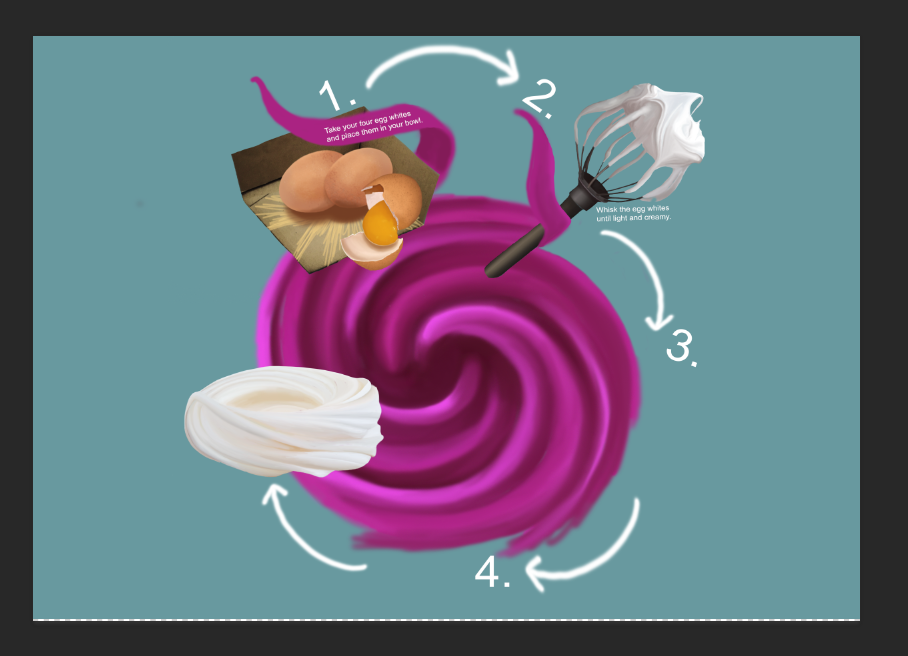
To give my recipe this further order to it, I added in further numbers, and some arrows in order to give the design a flowing sense to it. The arrows I have used were drawn with a Wacom tablet, and this is something I feel was done in the ‘apple cider’ instructional illustration, which appeared quite effective, and therefore I used this same process for my design. I had previously got my illustration on a A3 Portrait style document, but have now changed its orientation to Landscape, in hope to fit my design on the sheet easier and neater. This was something simple, yet I feel very effective in my design, as I feel it shows the circular shape of my recipe better.

The next step of my design was to add another ingredient to my design, as I needed to fill in each step of the recipe with illustration. Above is a picture I intend to copy, which I found on google images.


I started off drawing the spoon by using the brush tool, on a soft setting, and the colour mixer tool to blend in all the colours. As I have spent so long on the rest of my illustration, I do not have much time left and therefore feel I will not be able to produce my spoon in as much detail as I would’ve liked. However, so far I am happy with how the spoon is turning out.


I then went on to add in the sugar on-top of the spoon. To do this, I used a brush tool which gave me a powdery-looking effect. In the first screenshot, it is shown that this brush tool has made the intended sugar appear as though it is in some sort of cubed shape. The sugar in the image I was copying from seems as though it is quite free to move, yet I have made it appear as though it is in blocks-like sugar cubes. To get rid of this appearance to it, I continued layering up the white colour with this brush tool, and then shaped it using a soft rubber tool, erasing the harsh edges. However, I feel the sugar still appears as though it is some sort of soft powder, and am therefore not happy with how it has turned out at all.

Despite not being happy with my spoonful of sugar, I continued to go on and add it into my recipe.

I then added text in next to the sugar, to explain the process needed to go with the illustration. I additionally have continued to work on the strands coming from the swirl, and have wrapped them around the meringue, and up and over the spoonful of sugar.

As I still feel that the text needed for the eggs does not fit on-top of the pink strand that well, I have moved it from where it originally was. I have also added further text into my recipe, and made each area of text larger, so the recipe is clear and easy to read. I feel that having each piece of text at a slanted angle helps add an element of craziness into the recipe. However, overall, my recipe does not appear overly crazy and therefore feel it is not meeting the brief that well.

Here I have added in the last piece of text, next to the number 4. in my recipe. However, I feel this text does not work by itself and defeats the point of using illustration without and image to go with it. I am therefore planning to produce another illustration to go in this space.

This is an image I have got from google, and intend to copy to show the idea of using food coloring as a potential step in my recipe.

Above is a screenshot of the process of copying the food colouring image. To make it suit my recipe, I am going to use the Photo Filter tool to change its colour.

This is what my recipe looks like with the food colouring added into it. I duplicated the food colouring bottle I had drawn using a Wacom tablet, and then using the Photo Filter tool, changed its colour to make it appear as though it is a different bottle.
At this point, I feel my recipe looks quite good, and has crazy elements shown through the slanted typography, and pink spiral which holds the recipe together. However, I feel it needs to fit this ‘crazy’ element more, as it is not overly crazy, and does not represent Dan Lovell-Bray that well.

To add in a further sense of craziness, I have created a new layer and placed this beneath the rest of the layers in my design. On this layer, I have used the brush tool, on a soft setting, and drawn a dark pink spiral effect around the center spiral of my design. Immediately, I feel that this has brought my recipe to life and given it a greater sense of craziness. I feel it makes my recipe appear a lot more fun than it had done before, and made it more appealing.

I continued experimenting further with this pink spiral background, and looking back on my research into the Pink Sunrise Smoothie, found that they had used a lighter pink for the background of their illustration. As I felt this colour worked well for their recipe, I experimented with my design by changing this dark pink into a lighter one, and found that this worked better than the dark pink I had originally gone for. Additionally, I feel that this gives the background of my design a strong representation of what the recipe is showing, as the light pink has a stronger link to candyfloss.

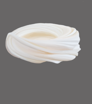
Above is the scanned in cotton wool texture that I am going to use for the candyfloss part of my illustration. I am hoping to use the rubber tool to cut this out, and then using the photo filter tool, to change the colour to pink, to resemble candyfloss.

Once I had placed the candyfloss in the center of the pavlova, my recipe illustration was almost complete. The last thing it needed was a title, which I placed in the center of my design, at an angle to match the rest of the slanted typography. I am overall very happy with how it has turned out, and feel that the ‘non alcoholic apple cider’ was particularly helpful in order to give my recipe an exciting composition, whilst the colours in the Pink Sunrise Smoothie have been very beneficial to me when deciding on a colour scheme to use for my design.

