Final Evaluation

When I first got the brief I was quite pleased with what it was asking me to do. This is because I felt confident in drawing different things and therefore felt that this illustration task would suit me quite well. However, despite looking forward to working on the brief, I knew that the tasks set would be incredibly time consuming, and therefore knew I needed to start on the brief as soon as possible.

I don’t feel that there was a part about the brief I enjoyed working on more than another, as I enjoyed everything about this brief. I found some areas of it tricky however, as I changed my ideas quite a lot throughout the process after discovering things which worked and didn’t work as well, such as the minor obstacles I had to overcome when using illustrator to make my app icon.

My research helped me a lot with this process of illustration as I found that looking at other peoples work was inspiring, and allowed me to gain knowledge into things that were more successful than others. For example, I found that text was something not that needed for illustrating app icons, and it was something which was not used much throughout the app icons I looked at. This helped me to inform my ideas for my own app icon illustration.

Another part of the overall brief I found quite tricky was the inclusion of the ‘crazy’ aspect which Dan Lovell-Bray’s cooking required. I found that my illustrations began quite simple, and then as I took another look at them found they needed a lot of development in order to complete the crazy aspect of the brief.

The most successful part of my app icon I believe is the composition of the illustration itself, as I feel my illustration fits the shape of an app icon. However, my original aim was to give my app icon a 3D sense, which is something that did not go so well, as it was not as professional looking as I was hoping. Despite this, I am happy with the overall quality and finish of my app icon, as I had very little experience in Adobe Illustrator, and I feel that my app icon turned out particularly well despite this.

To improve my app icon, I feel I would work on the ‘craziness’ of it, as I feel that this is something which does not show very strongly within it. To do this, I would add something further to my design so it is not just a cooker, and therefore is perhaps a bit more interesting. This would then additionally help it fit the brief further.I feel that my final app icon does fill the brief, as it has a sense of craziness, and clearly represents the fact that it is a cooking app, due to the imagery used. I additionally feel it is of quite high quality, which makes it fit the brief further, and makes it suitable to use as an app icon.

My instructional illustration is my least favorite design I have produced, as I felt throughout the design process I had no idea what I was aiming my design to be like like, and therefore found it a particularly tricky, time consuming process. My favorite part of the illustration is the background, and composition of the illustration, as I feel putting it around a circular, spiral shape is what allowed the design to come together well, and it what makes it stand out. I additionally like the colour scheme, influenced by a Smoothie recipe I had looked at, and I felt this helped me a lot in making key decisions in my design work. The part I am least fond of about my instructional illustration is the food colouring bottles, and the spoon with sugar on, as both appear to be quite flat and unrealistic illustrations, due to the fact I ran out of time to produce them, as I spent so much time on other illustrative areas (such as the eggs and whisk.) To improve my instructional illustration, I would develop these two areas further, making them more realistic. I would also experiment with typefaces further, as this is something I didn’t have a lot of time to do.

However, overall I feel that my instructional illustration fits the brief quite well, as it shows a sense of craziness through the bright pink colours and the composition, along with the slanted typography.

Producing my magazine spread was something that was incredibly time consuming, and is the thing I feel I put the most work into out of all the illustration work I have produced for this project. My favorite part of the illustration is the chef combined with the tomato, as I feel that the tomato was a very successful feature, which added to the illustration of the chef fairly well. Together, I feel these help to convey a crazy sense, and use two different materials, yet fit together nicely. The part I feel is least successful about my magazine spread illustration is the typography used to go with the magazine spread, as I feel that it is boring, and does not work well with the design. Another part I am less fond of is the hair of the chef, as I feel that this is quite unrealistic, and this is a part which I found quite challenging to draw using a Wacom tablet. If I were to do this illustration again, I would scan in further textures (perhaps one to use in the hair) and use more watercolour painting, as I feel that this is a very strong part in the design. Due to the random paint splatters, and tomato-faced chef, I feel my design is crazy and therefore fits the brief well.

My research is something I feel helped me a lot with this project, as each element of my design work was influenced by my research. My magazine spread was influenced by many aspects of my research, such a Jamie Oliver’f food revolution day magazine spread, which featured of lots of different items of food scattered over a page. Another key influence for this design was the Wacom illustration by Simply Sabba, something which influenced me to use a person for the main focal point of the article. My research came in useful in my app icon illustration through patterning when designing oven gloves based on a cookery app I had found online and additionally through the three dimensional look which I wanted to achieve like Julian Burford had done. In my instructional illustration, I used the circular composition, inspired by an apple cider recipe, and a pink and white colour scheme similar to a pink smoothie recipe found on google images. Each area of my research therefore played a key role in helping the development of my illustration throughout the project, and is something that helped the success of each illustration.

Overall, the part I found hardest about this project was trying to include a ‘crazy’ element in all of my designs. This was something that I ended up including mostly at the final stages of each design, as I found it hard to include in my original ideas. However, I feel I mostly successfully did this, making each of my designs quite successful.

Instructional Illustration

For my instructional illustration I am going to design a recipe informing people as to how to make a candy-floss pavlova. I chose this particular food as I feel it is quite crazy, as takes a stereotypical pavlova, and uses a slightly more un common combination (seen through adding candy-floss to the top). I intend to produce a Wacom drawing in Photoshop, and then perhaps develop it further by using scanned in media.

Starting my Illustration 

Using Google images, I found a picture of two eggs which I planned to draw as the first step of my instructional illustration. Despite my recipe involving four eggs, I decided to start with two, and later draw more, or explain within my recipe that more than two is needed. Screen Shot 2017-05-11 at 15.47.06

The three photos below show the process I took when drawing out the first egg. Using the eyedropper tool, I selected different areas of the egg and drew them over the top of the image. This was in an attempt to get the most accurate colours to use as the egg. Then, using the Mixer Brush Tool, I mixed the colours together as smoothly as I could to get them as close to the actual appearance of the egg as I could. At this point I felt my egg was done, but comparing it to the image, it seemed considerably different. Once taking a closer look at the photo, I realised that the egg was speckled, and therefore did not have as smooth an appearance as I had assumed. To add the speckles, I used brush number 66, (located in the brush panel), and used it to create this dotted effect. Now I have completed one egg, I intend to go on to working on the next one.

Screen Shot 2017-05-11 at 15.50.55Screen Shot 2017-05-11 at 16.03.26Screen Shot 2017-05-11 at 16.13.45

When deciding how to produce my second egg, I realised that I could save a lot of time by duplicating the first one I had drawn, and by shading, make it look like a second egg. I also decided to make my design differ from the original photo slightly, by putting the eggs closer together and then placing the shading in the centre, below them. The reason for putting the eggs so close together was due to feeling they appeared more like they were floating with the gap between them in my illustration. I therefore felt that my design was stronger if they were not parted.

Overall, I am not that happy with the eggs I have drawn and despite trying to make them look quite real, I feel that they’re  strange shape and the shading is unrealistic. If I have time, I may come back to develop them further because of this. Screen Shot 2017-05-11 at 16.17.36

Now I am onto the next part of the illustration, where I am going to draw another egg (this time cracked open) to show the idea that the egg yolk must be parted from the egg whites. Without showing, or explaining this, the recipe could go quite wrong. The picture below I found on Google images, and intend to draw to show this process.

Screen Shot 2017-05-15 at 15.28.39.png

Using the same process as what I used to draw the first lot of eggs, I have started to work on the next egg illustration.

Screen Shot 2017-05-11 at 16.51.16Screen Shot 2017-05-11 at 16.56.21Screen Shot 2017-05-11 at 17.19.05

To put a speckled effect on my egg, I used a brush tool that allowed me to create a spotted effect. This made this part of the design a lot easier to complete as it speeded up the process of adding the dots individually. Screen Shot 2017-05-13 at 15.35.41Screen Shot 2017-05-13 at 15.43.11

Once completing this illustration I placed it next to the other eggs I had drawn. By themselves, I feel as though the eggs look as if they are floating in mid air. Therefore, in my further design process I am planning to put the eggs in some kind of box, giving the illustration more of a structure to it.

Screen Shot 2017-05-13 at 15.45.38

(above picture found on Google images)

I am going to copy this image of a whisk head, as it shows the effect of mixing eggs until they are light and fluffy. This is something which is part of my recipe, and therefore I felt the need to show this through my illustration. I feel that this is going to be very time consuming and tricky to draw, as it is multiple shades of white, which means I will have to be very accurate with my colour placement.

Screen Shot 2017-05-13 at 16.01.34Screen Shot 2017-05-13 at 16.08.06Screen Shot 2017-05-13 at 16.58.41

I started off this illustration process by outlining areas of the egg white mix, and then filling in sections using the brush tool, and colour mixer tool to blend the colours together. At this stage I am happy with how this illustration is progressing as I am finding it very time consuming, and incredibly difficult to draw. This is due to the amount of detail I am having to put in it, to make it as realistic as the picture. I am using a photograph from google to copy as I found this to be of a better quality than the photograph I took of this process.

Screen Shot 2017-05-13 at 17.08.55Screen Shot 2017-05-13 at 17.55.52

Screen Shot 2017-05-15 at 15.29.03.png

I am incredibly happy with how this element of my design has turned out. However, as I have been focusing on it for so long, it is becoming tiring and I feel if I do not move onto another part of the design soon, I won’t be able to complete the illustration as a whole piece.

Screen Shot 2017-05-15 at 15.28.57.png

(picture above found on Google images)

Due to being bored of working on the egg white mix, shown on the whisk, I have decided to start working on another part of my design, which is the Pavlova itself. As it is another item which is purely different shades of a white colour, I feel that this illustration will be equally as as hard due to this factor.

Screen Shot 2017-05-13 at 18.40.12

I have started the process of drawing the pavlova by using the brush tool and marking out the colours in the pavlova, and then blending them in further with the colour mixer tool. The colour mixer too is something I have used a lot in my design process so far, and feel it is a tool that works well for me. However, sometimes I do find it tricky to use, as when blending two colours together, it tends to make one colour come out a lot stronger than the other. This is something I have had to overcome by continuing to work over the areas I have blended together.

Screen Shot 2017-05-13 at 18.51.21Screen Shot 2017-05-13 at 19.36.49Screen Shot 2017-05-13 at 19.51.14Screen Shot 2017-05-15 at 15.02.40Screen Shot 2017-05-15 at 15.16.47

Now I have finished my pavlova, I am extremely happy with the outcome. It was incredibly time consuming to produce however, and I have therefore lost a lot of time on my other illustrations.

Screen Shot 2017-05-15 at 15.32.56.png

Above is a screenshot of my three different Wacom drawings. Zooming out and looking at them like this makes me realize how much more is needed on my instructional illusion, as I have spent a lot of time so on it so far and it is not crazy, or purposeful yet, so does not fit the brief at all.Screen Shot 2017-05-16 at 16.13.45

I have decided to work back into my egg illustration, by giving it less of a ‘floating’ effect. To do this, I have taken a picture of a cardboard box, and placed it beneath the eggs drawing. Screen Shot 2017-05-16 at 16.22.32

I have then reconstructed the box and using the rubber tool, rubbed out the areas that I didn’t need. However, I found it difficult to give the box straight edges, and therefore used rectangular shapes (coloured white) to place over the top of the box, giving it straight edges.Screen Shot 2017-05-16 at 16.25.12Screen Shot 2017-05-16 at 16.32.49Screen Shot 2017-05-16 at 16.43.51

Here I have experimented with two different types of text, to go alongside my illustration. I feel that the second example of typography I have used is the most successful, as it is a lot clearer to read than the hand drawn typography.

Screen Shot 2017-05-25 at 13.30.12.png

Above is a recipe that I am particularly fond of due to its composition, and is something I am hoping to base my work around due to the successes of how its composed. I am fond of the circular shape in the centre of the illustration, and like how the recipe is based around this. I am therefore hoping that I will be able to use a circular shape to base my work around, and bring out this ‘craziness’ which is in the brief, as I feel it is a different composition to the normal recipe style.

Screen Shot 2017-05-24 at 11.06.21

Above is an image, taken from google images, and is the image I am hoping to draw a copy of to base my recipe around. I m hoping to change its colour, and feel that this will then resemble a pavlova further, and will be effective for my recipe composition and structure.

Screen Shot 2017-05-24 at 10.02.48Screen Shot 2017-05-24 at 10.03.01Screen Shot 2017-05-24 at 10.10.14

On the left of my swirl illustration is the photograph I am copying. I changed the colour using the ‘photo filter’ tool. As I applied one layer of pink to the photo, I found that it was still slightly brown, and therefore had to use this tool three times in order to change it to the bright pink colour I intended to have. This is an obstacle I had to overcome, as I do not know another way I could change the colour of the photograph, and therefore had to rely on using the Photo Filter tool multiple times to achieve a pink effect.

Screen Shot 2017-05-24 at 10.13.21

I have started to develop my swirl illustration further, and am quite pleased with how it is turning out. However, I have found it quite tricky to produce as I was hoping to get it as close to the picture of possible, but feel despite it being close, this desired effect was not achieved.

Screen Shot 2017-05-24 at 10.41.51

Now I have completed the swirl part of my design, I have placed it in the center of my recipe illustrations, and have placed these over the top of it, pushing the swirl into the foreground. I felt it was important to keep the swirl in the center of the recipe design in order to achieve this circular effect I was aiming for, based upon the apple cider recipe illustration I had previously looked at. Placing it in the center of the recipe is something I am hoping to seem quite effective in my design work, as I feel the spiral sense it has will hopefully draw the readers eyes around the recipe.

I chose to make this part of my illustration pink as i felt this would bring my illustration to life, and eliminate the boring sense it had to it. I am hoping to make my recipe appear fun, which will make it stand out, and hopefully also make it appealing. The colour pink in particular is something I felt worked well in a recipe I found as part of my research.

pink recipe

‘Pink Sunrise Smoothie’ is a recipe illustration I found online, its designer/illustrator is unknown. The recipe itself is something which is quite unclear, as without doing further research into it, I wouldn’t have known what this illustration is supposed to be representing. However, I chose to look at this recipe as I was particularly interested in the colour scheme used. As the recipe is for a ‘pink’ sunrise smoothie, the colour scheme is incredibly relevant to the drink, giving the colour scheme a key purpose in the design. Additionally, I feel that the contrast between the white and pink is something which makes the design particularly strong, as the white shows up well against the pink background, making each illustrative area clear.

As my recipe is for a candyfloss pavlova, and candyfloss is generally known to be pink, I felt that this colour scheme could work incredibly well for my design, especially as the pavlova illustrations I am producing are white. Therefore, the colour scheme of this design is what has influenced me to make the swirl in the center of my recipe a pink colour, in hope to make the design appealing, and show the illustrations on top of it to stand out clearly. However, I have not used a flat pink such as the one used in this smoothie recipe, as I feel that this makes the design seem overall very flat, and therefore gives the illustrations less of a realistic appearance. As I was aiming for a realistic appearance, I have used more than one pink colour to make my design three dimensional, to prevent any kind of flatness.

A development that can be seen to my swirl illustration is the fact that I have extended it, to give it an end which folds over the box of eggs. I have done this to make the ingredient feel as though it is included within the swirl further, as I felt the appearance of the swirl underneath the ingredients looked quite random. Despite doing this, I am still not that happy with how my illustration looks, as I feel that it looks quite strange, and nothing fits together. The only way to adapt this is to continue working on the illustration, in hope that my recipe will come together once more information has been added to it.

Screen Shot 2017-05-24 at 10.43.17Screen Shot 2017-05-24 at 10.47.13Screen Shot 2017-05-24 at 10.50.37

As I have continued to develop these curved over areas that have come off the spiral, I am beginning to be happier with how my illustration is looking. I found that adding darker areas to these parts that are coming off the spiral allowed them to fit with the design further, and they are starting to connect the ingredients to the spiral in a more successful way. To add in these darker areas, I used a dark colour which I selected from my spiral using the eye dropper tool, and then using a low opacity soft brush, I drew on the darker areas of colour.

Screen Shot 2017-05-24 at 10.52.59

The next step of designing my recipe I took was adding in the text. Previously in my design work for this instructional illustration I found that using typography from Photoshop seemed a lot more professional than hand drawn typography, and therefore decided this was the best type to use in my design. I had previously placed text next to these areas of my recipe, yet had to remove them again after changing my design quite drastically.

Here I have placed the typography on-top of the strand coming from the spiral. I am quite pleased with how this looks, and feel it includes the spiral in with the recipe further.

Screen Shot 2017-05-24 at 10.55.18

I then moved onto adding the next bit of typography, next to the whisk. I had tried placing the text on-top of the pink strand that is wrapped around the whisk, but felt the angle was hard to read, and it meant the typography had to be incredibly small. Therefore, I moved it next to the whisk, and left it there. I now feel that my recipe is looking quite random, especially as one area of text is within the pink spiral shape and another isn’t. This is something I feel I am going to have to perhaps work on further in my design, as I am not happy with the placement of it.

I additionally added numbers to my  instructional illustration, as this is something I had previously done to it and felt it worked well in showing the order of the recipe, making it seem simpler, and therefore added these numbers in again.

Screen Shot 2017-05-24 at 11.05.31

To give my recipe this further order to it, I added in further numbers, and some arrows in order to give the design a flowing sense to it. The arrows I have used were drawn with a Wacom tablet, and this is something I feel was done in the ‘apple cider’ instructional illustration, which appeared quite effective, and therefore I used this same process for my design. I had previously got my illustration on a A3 Portrait style document, but have now changed its orientation to Landscape, in hope to fit my design on the sheet easier and neater. This was something simple, yet I feel very effective in my design, as I feel it shows the circular shape of my recipe better.

Screen Shot 2017-05-24 at 11.07.47

The next step of my design was to add another ingredient to my design, as I needed to fill in each step of the recipe with illustration. Above is a picture I intend to copy, which I found on google images.

Screen Shot 2017-05-24 at 11.12.58Screen Shot 2017-05-24 at 11.14.36Screen Shot 2017-05-24 at 11.18.29

I started off drawing the spoon by using the brush tool, on a soft setting, and the colour mixer tool to blend in all the colours. As I have spent so long on the rest of my illustration, I do not have much time left and therefore feel I will not be able to produce my spoon in as much detail as I would’ve liked. However, so far I am happy with how the spoon is turning out.

Screen Shot 2017-05-24 at 11.19.13Screen Shot 2017-05-24 at 11.21.21Screen Shot 2017-05-24 at 11.22.56

I then went on to add in the sugar on-top of the spoon. To do this, I used a brush tool which gave me a powdery-looking effect. In the first screenshot, it is shown that this brush tool has made the intended sugar appear as though it is in some sort of cubed shape. The sugar in the image I was copying from seems as though it is quite free to move, yet I have made it appear as though it is in blocks-like sugar cubes. To get rid of this appearance to it, I continued layering up the white colour with this brush tool, and then shaped it using a soft rubber tool, erasing the harsh edges. However, I feel the sugar still appears as though it is some sort of soft powder, and am therefore not happy with how it has turned out at all.

Screen Shot 2017-05-24 at 11.24.58

Despite not being happy with my spoonful of sugar, I continued to go on and add it into my recipe.

Screen Shot 2017-05-24 at 11.37.33

I then added text in next to the sugar, to explain the process needed to go with the illustration. I additionally have continued to work on the strands coming from the swirl, and have wrapped them around the meringue, and up and over the spoonful of sugar.

Screen Shot 2017-05-24 at 11.45.55

As I still feel that the text needed for the eggs does not fit on-top of the pink strand that well, I have moved it from where it originally was. I have also added further text into my recipe, and made each area of text larger, so the recipe is clear and easy to read. I feel that having each piece of text at a slanted angle helps add an element of craziness into the recipe. However, overall, my recipe does not appear overly crazy and therefore feel it is not meeting the brief that well.

Screen Shot 2017-05-24 at 11.49.14

Here I have added in the last piece of text, next to the number 4. in my recipe. However, I feel this text does not work by itself and defeats the point of using illustration without and image to go with it. I am therefore planning to produce another illustration to go in this space.

Screen Shot 2017-05-24 at 11.51.47

This is an image I have got from google, and intend to copy to show the idea of using food coloring as a potential step in my recipe.

Screen Shot 2017-05-24 at 11.56.31

Above is a screenshot of the process of copying the food colouring image. To make it suit my recipe, I am going to use the Photo Filter tool to change its colour.

Screen Shot 2017-05-24 at 12.00.30

This is what my recipe looks like with the food colouring added into it. I duplicated the food colouring bottle I had drawn using a Wacom tablet, and then using the Photo Filter tool, changed its colour to make it appear as though it is a different bottle.

At this point, I feel my recipe looks quite good, and has crazy elements shown through the slanted typography, and pink spiral which holds the recipe together. However, I feel it needs to fit this ‘crazy’ element more, as it is not overly crazy, and does not represent Dan Lovell-Bray that well.

Screen Shot 2017-05-24 at 12.08.15

To add in a further sense of craziness, I have created a new layer and placed this beneath the rest of the layers in my design. On this layer, I have used the brush tool, on a soft setting, and drawn a dark pink spiral effect around the center spiral of my design. Immediately, I feel that this has brought my recipe to life and given it a greater sense of craziness. I feel it makes my recipe appear a lot more fun than it had done before, and made it more appealing.

Screen Shot 2017-05-24 at 12.09.20

I continued experimenting further with this pink spiral background, and looking back on my research into the Pink Sunrise Smoothie, found that they had used a lighter pink for the background of their illustration. As I felt this colour worked well for their recipe, I experimented with my design by changing this dark pink into a lighter one, and found that this worked better than the dark pink I had originally gone for. Additionally, I feel that this gives the background of my design a strong representation of what the recipe is showing, as the light pink has a stronger link to candyfloss.

Screen Shot 2017-05-24 at 22.11.31

Above is the scanned in cotton wool texture that I am going to use for the candyfloss part of my illustration. I am hoping to use the rubber tool to cut this out, and then using the photo filter tool, to change the colour to pink, to resemble candyfloss.

Screen Shot 2017-05-24 at 22.11.19

Once I had placed the candyfloss in the center of the pavlova, my recipe illustration was almost complete. The last thing it needed was a title, which I placed in the center of my design, at an angle to match the rest of the slanted typography. I am overall very happy with how it has turned out, and feel that the ‘non alcoholic apple cider’ was particularly helpful in order to give my recipe an exciting composition, whilst the colours in the Pink Sunrise Smoothie have been very beneficial to me when deciding on a colour scheme to use for my design.

Screen Shot 2017-05-24 at 22.23.53

Magazine Spread Illustration

My intention for this magazine spread is to create a crazy interpretation of the chef; Dan Lovell-Bray, and showing him through a Wacom drawing produced in Photoshop. I also intend to use scanned in textures, to create a more interesting piece. A lot of the magazine spreads I have looked at for research show a use of a range of materials, such s watercolour paint, which combined with digital work, make the magazine spreads stand out particularly well. I therefore feel that this gives me the incentive to use more than one type of material in my design work.

Photo development for my illustration work

Below is the image I am going to use to represent the chef. I am going to adapt the picture to give it ‘crazy’ qualities, by incorporating different elements of food onto his face, representing the idea that he is a chef, and connected with food. Once I have adapted this photograph roughly as to how I want it, I will draw my illustration using a Wacom tablet.

Screen Shot 2017-05-17 at 17.43.05

To develop this picture, I have started to use a red colour, which I have drawn around the persons eyes. I drew this red with the brush tool, set to a low opacity. I then changed the layer style to ‘overlay’ s this allows the skin tones to still come through in the piece, making the red appear s though it was actually on his face. I started by making this layer quite lights, and then changed it to  brighter colour using the ‘photo filter tool’. Whilst also making the colour more vibrant, this tool allowed me to experiment with different red tones choosing the one that I felt would be best suited.

The reason for using red for this part was to link into a tomato, a vegetable I intend to use in my further design work, to bring out this idea of craziness with both the food and chef.

Screen Shot 2017-05-17 at 17.50.50Screen Shot 2017-05-17 at 17.57.21

The below image is a  free photograph from google images, which is of tomato seeds. I am going to draw these out roughly, and place them on the chef’s face. By doing this, I will show an element of craziness as he chef has food on their face. I am only planning to draw these seeds out roughly with the pen tool, as I will be drawing them out in more detail later when producing my illustration.

Screen Shot 2017-05-17 at 17.58.35Below is a screenshot of one of the seeds I have roughly drawn. I am going to duplicate this and use it further in this design.
Screen Shot 2017-05-17 at 17.59.41

Here I have placed the seeds around the chefs eyes.

Screen Shot 2017-05-17 at 18.02.02Screen Shot 2017-05-17 at 18.07.12

In this screenshot below, I have slightly adapted the colour of the chefs lips, pushing them to be more similar to the colour of a tomato. I feel that this will help my overall design have that sense of craziness which was required for this project in the brief. Zooming out to take an overall look at the appearance of the chef now has allowed me to get a good look at how the changes are looking on my photograph. So far, I am happy with how it looks, and feel that producing an illustration based on this image will be quite effective. Something I am less happy about with this photograph, is the face that it is slightly blurred showing it to have lost some quality, reducing the professional appearance I was aiming for. Despite this, I feel I will be able to regain some quality when drawing the image, but feel it could be quite tricky.

Screen Shot 2017-05-17 at 18.11.53

Now I have added tomato seeds to the lips of the chef. I have additionally made the centre part of his lips slightly whiter, which I did to make more like the tomato image I have. I did this by using a low opacity white brush, and drawing subtle hints of white over his lips. However, I do not like the appearance of this, and believe it looks quite strange. As I am undecided as to whether I should include these seeds or not, I am going to leave them there and then when it comes to drawing my illustration, decide then whether to use them or not.

Screen Shot 2017-05-17 at 18.25.26

This is an image of  sliced tomato I took, in order to inspire my design. I am also going to use the tomato for a main part of my image, to show the strong connection between the chef and food.

Screen Shot 2017-05-17 at 18.28.28

In the images below, I have cut around the edges of the tomato using the rubber tool, and then placed it covering the chefs eye. After doing this, I used a low opacity brush, and with a dark red, I started to add in shaded areas to the tomato and the face of the chef. Cutting round the tomato was something which I found tricky to do, as I had to keep a steady hand using the Wacom tablet. I originally tried cutting it out using the lasso tool, which I found harder, so reverted back to the rubber.

A further development can be seen in the last image, as I have used a black brush tool to outline the chefs face, and block out the grey background of the photo. Based on my research, I found that a black background was something which made the image very effective, and therefore applied this to my own work.

This magazine spread featured below is the main inspiration for the imagery of my magazine spread. It is by’Simply Sabba’ and part of a series of illustrations called ‘iAMART’. I chose to look at this digital illustration as part of my research as I feel that the illustration itself is particularly strong, and is something I am quite drawn to. Believing that this piece was done in Photoshop using a Wacom tablet is something which partly inspired me to produce my own illustration this way. Additionally, covering one eye of the person adds a sense of intrigue when looking at the illustration, as their total identity is not revealed, and therefore I feel that this is a quality which could work well with the article title that the briefs magazine spread has of; ‘Who is Dan Lovell-Bray?.’

However, a part of this illustration I am less fond of is the articles layout, which I feel does not include the typography within the design, but makes them seem quite distant from each other. This is something I will not be taking from the design when using it as inspiration for my work.

Designing my Illustration

To start my illustration, I am focusing on the single eye in the picture, and am hoping to work my way out from this. As only one eye is pictured in my adapted photograph, I believe that this is an incredibly important point to get as accurate as possible.

Screen Shot 2017-05-17 at 10.24.41Screen Shot 2017-05-18 at 12.00.58Screen Shot 2017-05-18 at 12.01.00

I started off my illustration by using the bush tool to draw in key shapes of colours, and gradually beginning to blend them together using the colour mixer tool. The colour mixer tool is something which allows me to blend the colours together smoothly, and create gradient-like effects with the colours. This is quite a time consuming process, as I am aiming to get the colours and shading as accurate as possible, and therefore means I have to be very precise with my work. At this early stage, I am not happy with the appearance of the eye I have produced, as it appears very ‘cartoonish’ and unrealistic. This may be due to the lack of detail within it so far.
Screen Shot 2017-05-18 at 12.04.13Screen Shot 2017-05-18 at 12.07.42Screen Shot 2017-05-18 at 12.11.11

As I continue to blend the colours around the eye, I feel that the eye is continuing to become less realistic, and the quality of the design is not that strong. However, to get over this, I feel that the best way is to continue working over the eye and build up more tones in the face of the person. Once the majority of the facial colours are blended, I feel I am going to have to work over it, highlighting the areas of lesser smooth skin, and adding in things such as small freckles, to make the face more realistic. I am not particularly finding this design too challenging, but am still not happy with how it is progressing.

Screen Shot 2017-05-18 at 12.14.10Screen Shot 2017-05-18 at 12.21.06

The next step was to continue developing the face and so I have started to fill in areas of block colour around the head of the chef. Despite the precise nature of the eyedropper tool, I found it very hard to get the precise colours to use, as once I began to blend them, the colours were no longer the same and therefore meant I had to continue layering them up. Once I had zoomed out to look at the overall image, I decided I was still unsatisfied with how my illustration was turning out as it still strongly resembled an animated figure. This I believe is strongly brought on by the smooth surface of the chef’s forehead, and due to being so frustrated with how it looks, I moved onto a different area of the face to work on.

Screen Shot 2017-05-18 at 12.33.06Screen Shot 2017-05-18 at 12.37.39

I started off working on the nose by aiming to use the brush tool, and less of the colour mixer tool, in order reduce the smoothness of the colours, and to see if this would work better than the method I had been using so far, of smoothing everything down with the colour mixer tool. I began by adding shades of colour by scribbling them down using the brush tool. After doing this, I blended them slightly using the colour mixer tool. This initially gave me that smoothed down effect I was trying to avoid. To get over this, I then selected a low opacity (of around 10 or 11) and began using a stippled effect to place uneven dots, and lines over the top of the smooth colours I had originally created. I continued this process throughout the next through stages of my illustration process.

Screen Shot 2017-05-18 at 12.42.16Screen Shot 2017-05-18 at 12.49.27Screen Shot 2017-05-18 at 12.54.58

By continuously placing small dots and then smoothing various areas with the colour mixer tool, and then repeating this process, I feel that the nose is beginning to come along nicely. I am therefore beginning to see a bit of hope for my illustration, as I hope to use this process further in my work as it seems to be quite effective for the nose of the chef. I believe that whilst finishing the areas around the nose, I need to continue to work on the chef’s forehead as this is beginning to restrict the potential of the design. I additionally feel that I should begin to add in the lips as this may make my design progress faster as I can begin to see all the features and how they work together.

Screen Shot 2017-05-18 at 12.57.00

Screen Shot 2017-05-18 at 13.02.19Screen Shot 2017-05-18 at 13.05.22Screen Shot 2017-05-18 at 13.18.52

In the next few stages I have began to add, and fill in the lips mostly using the brush tool on a low opacity, and the colour mixer tool to blend the colours in together. I additionally have continued to work on the skin tones by roughly filling in different places on the chefs face and then blending them together with the colour mixer tool. I am incredibly happy with how the lips have turned out so far as I feel that they are quite close to the original picture. Overall, as my design is still just a face, I feel it is not fitting the brief that well. However, I feel as my illustration progresses, I can add in some elements of food which will begin to show this person is a chef.

Screen Shot 2017-05-18 at 13.31.22Screen Shot 2017-05-18 at 13.37.06

Screen Shot 2017-05-18 at 13.43.27

As I continue to add in colour and blend each area together, I am beginning to feel happy with my illustration. I feel through the blending of the tones within the face, my illustration is showing a strong connection to ‘Simply Sabba’s’ work. In her illustration, she blended the colours wishin the face of the person she was drawing using quite a smooth effect. This is something I have continuously done throughout my illustration, but am hoping to additionally add areas that are slightly more detailed in order to give my design more of a realistic appearance.

Screen Shot 2017-05-19 at 11.21.34

Here is where I encountered the biggest problem when producing this illustration so far. As I went to use the mixer brush tool, this message popped up saying that there was not enough memory to use it. I clicked OK, and immediately tried using the mixer brush tool again, only to find this message to come straight back. This message is something I have never encountered when using Photoshop, and therefore had no idea what to do. I went on google to see if I could find a solution to this problem, and found a few solutions, each of which I was unsure how to do. So, I went back to Photoshop, and continued to try and work out how to find a solution to the problem. Once again, I pressed OK and tried using the mixer brush tool. As I went to use the brush, I noticed that the size of it seemed extremely large, and just as I pressed it down, this message popped back up. Realizing the brush setting seemed slightly larger than I had wanted it, I went to change to change it and noticed it was on the largest setting it could be at, and I must’ve set it to this accidentally. This is why the computer did not want me to use this tool, and therefore didn’t have enough memory for its use anyway.

Screen Shot 2017-05-19 at 11.23.22 Screen Shot 2017-05-19 at 11.27.20Screen Shot 2017-05-19 at 11.47.15Screen Shot 2017-05-19 at 11.47.16

After overcoming the memory issue that kept popping up on my screen I continued to use the mixer brush tool to blend in the tones, and get them as accurate as I could.Screen Shot 2017-05-19 at 11.58.59

After blending in further tones, I went on to start adding more detailed areas to the chef’s face, by using different brush tools to give the skin less of a smooth look. I added in areas of dots with a dotted effect and this helped to make the skin seem a bit more realistic.

Screen Shot 2017-05-19 at 12.10.53

As I continued adding in these dotted areas, I then zoomed out to see how the chef’s face was looking. Looking at my illustration like this I feel helps me to reflect on which areas of my design need to be worked on further. At the moment, I feel these dotted areas have really helped with the development of the persons face, and I am incredibly happy with how it is turning out. I feel it is finally beginning to look how I had wanted it to.

Screen Shot 2017-05-19 at 12.39.00Screen Shot 2017-05-19 at 12.41.23

As I feel that working on the small details of the face were working well for my illustration, I continued to work on small areas, such as the eyes. Here I have compared the eye illustration I have produced to the actual photograph, and using the brush tool, have added in small details to make it look closer to the photograph. I found that in the photograph, there was a darker area beneath the persons eye, so to add this in further, I added small dots beneath the persons eye to make this area seem darker. The reason for adding dots instead of block colour was to help give the face a textures appearance, and prevent it being completely smooth, as I found this quite unrealistic.

Screen Shot 2017-05-19 at 12.53.05Screen Shot 2017-05-19 at 13.00.30Screen Shot 2017-05-19 at 13.11.11Screen Shot 2017-05-19 at 13.24.05

Despite not finishing the illustration yet, I have set out my illustration in a magazine spread style, to see how it would work in a magazine. Looking at my illustration like this makes me feel quite happy with the way I have approached the drawing of the chef, as I feel it has worked quite well.

The composition of this magazine spread I based around the National Geographic magazine spread I looked at for research, titled “the man who wasn’t Darwin”. I chose to look at this for research as I liked the realistic details within the bird and felt that the composition of the magazine spread was incredibly different to those I had looked at previously. Placing the main illustration is something I felt worked quite well for the magazine spread, as I feel that your eyes naturally scan from left to right and therefore this have a different perspective, making the second page seem of high importance. Therefore, I placed my illustration on the right side of my page, in hope to achieve this same effect.

Something else which I found particularly interesting about the magazine spread was the negative space around the whole design, and the text. This was different from the jam-packed appearance of the rest of the magazine spreads I had seen, and therefore feel it made the design stand out. Yet despite this, I feel it is something which additionally gave the design flaws, as in some cases could be viewed as boring. Despite the conflicting views on whether this negative space worked, I decided to use negative space in order to see how it would work for my design.

Screen Shot 2017-05-22 at 11.10.14

Something I felt was not going to work on my design is the tomato, as the image I had taken and placed over the chef’s eye is something which I felt was off too much of a bad quality to try and reproduce through a Wacom drawing. Due to this, I felt that I needed to make a new one.

Here I have painted two tomatoes in watercolour paint, which could be adapted and used in my illustration work. I produced two tomatoes, in order to give myself a wider range to work with and allowing me to decide which one would be the strongest to use as a key part of my design. I am not that happy with these tomato as I found that it was a lot harder to produce a watercolour tomato than I had thought it would be. However, I am still hoping to use these in my design, but will adapt them in photoshop using things such as the contrast and photo filter tools.

Screen Shot 2017-05-22 at 12.43.36

In the image below I have used the rubber tool and brightened up the tomato with the contrast tool and then placed it over the top of the chefs eye. Now it is on the design I am incredibly happy with how it looks, as I feel it completely brightens up the magazine spread. Something I felt difficult when placing this tomato into the illustration was using the rubber tool to cut around the edges of it, removing it from the white background. I started off by using a rubber with a harsh edge, making the effect of the tomato seem quite flat. Using the undo button, I decided to start again as I wasn’t happy with the outcome. Then using a a rubber tool with a softer edge, I repeated this process, and felt a lot happier with the outcome as the tomato didn’t seem as flat as it had done before.

As I felt the tomato was a success, I experimented with different ways of placing it by duplicating the layer and changing its opacity along with the layer style. I experimented with the layer on ‘multiply’ and felt the effect was quite interesting as made the tomato slightly see-through. However, it turned the bright colour cute dull and so I therefore continued experimenting until I found the ‘overlay’ selection. This made my tomato remain bright and colourful, and remained with this translucent effect. I then placed the tomato onto the chefs clothing, which brightened up his outfit, and gave quite a crazy appearance- something I was happy with as I feel it fits the brief well.

Screen Shot 2017-05-22 at 12.22.51

Being so pleased with the watercolour tomato, I produced some splashes of watercolour paint which I then scanned in and placed over the eye of the chef, and am hoping to place further on his clothing. I believe that these add to the craziness of the chef, as they add a splash of colour and energy to the illustration.

At this stage in my design process, I feel that the illustration is fairly strong, but appears quite lonely and boring with the negative space around it (a bit like the National Geographic’s bird magazine spread did) Therefore, I am planning on continuing the splash of watercolours by putting them around the negative space near the chef. Also, by looking at a magazine spread titled ‘Lang Lit De revolute’; advertising Jamie Oliver’s world food day, I have seen an example of how filling the page with illustration can have quite a nice appearance. In this magazine spread, illustration fills the space around the text, making it seem quite energetic and fun. Therefore, I am planning to add in some further tomato to my design to brighten up the illustration further and remove the areas of native space, creating a more interesting design.

Screen Shot 2017-05-22 at 12.26.05

Below is the outcome of duplicating the tomato (inspired by the full effect in Lang Lit De Revolute) and using further watercolour splashes around the page. I changed the colour of the watercolour splashes by changing the layer style, and I felt these almost luminous blues and greens created a particularly interesting look and therefore felt they worked well as part of my design.

Screen Shot 2017-05-22 at 12.35.12

As I continued to work on my magazine spread I noticed something which was a huge flaw, and as I was so focused on the illustration side of things, I noticed I had forgotten about a key part in the design process. I have got a bright blue line down the middle of my magazine spread (provided by photoshop) to mark the centre of the page, something which the text in my magazine spread is running over. This meant, when the design were to be folded like an actual magazine, the text would be unreadable as it would run into the centre of the magazine and disappear down the middle.

I immediately fixed this by aligning my text into columns to make it more like a magazine spread. I then started working on the font of the title, to see which would suit my design most. The title featured below uses a text I downloaded off of the internet, after finding it appealing. However, now it is on my magazine spread, I feel it is not as effective as I had hoped it would be.

Another thing I did to develop my design was changing the composition of the chef, by pulling him further to the right hand side of the page so he does not overlap the centre, and then moving the tomato around him to fit with the rest of the design. I additionally added a yellow scribble to the bottom left hand side of the page, inspired by the scribbles that overlap the persons face in Simply Sabba’s illustration. This added further creativity, and craziness to the magazine spread, which I felt works well, and fits the brief.

Overall, I am incredibly happy with my design and feel it is almost done.

Screen Shot 2017-05-22 at 15.26.52

Despite previously feeling my design was practically finished, I noticed another vital part which needed adapting. The title still ran over the centre of the page. This however was an easy fix, as I simply deleted the original title, and added in a new one; additionally using a different font as I still didn’t like the one I had found on google.

After this I added a few final touches, through adding another yellow brush stroke, and a few random splatters of red paint.

I am not happy that my design is finished, and that despite it being a long process of figuring out what would work and what wouldn’t, my magazine spread has turned out quite successfully.

Screen Shot 2017-05-22 at 15.50.25

Screen Shot 2017-05-23 at 21.29.27.png

designing my app icon

To make my illustration I intend to use illustrator as I believe this to be the best application to design my app icon in. This is because of the simplistic shapes, and straight lines that can be produced within illustrator, which will allow me to make my app icon appear neat and professional. Despite feeling that using illustrator will be the best way to produce my icon, I am not looking forward to designing it as I have no experience in illustrator and therefore believe that designing my app will be a tricky process.

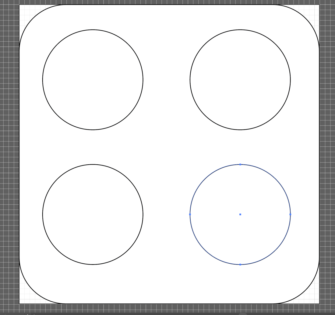
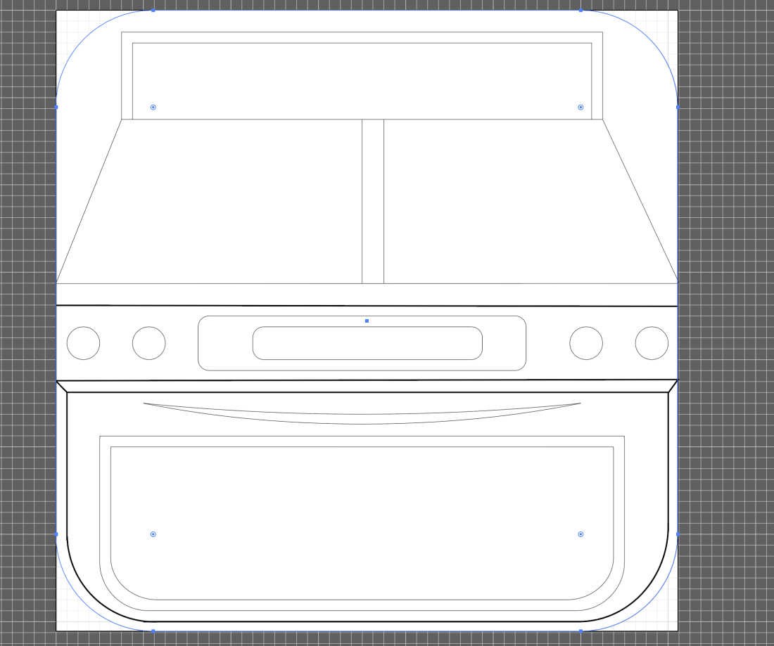
I started off making my app by adding a rounded rectangle to my art board within illustrator, and adapting the settings of the corner radius to be the perfect shape for an app icon. I got these dimensions from a you-tube video which allowed me to learn the correct shape to use for the base of my app icon. Based on my photographs I took for this project, I have chosen one of my images I feel will be best suited to my app design and use this to drive my main idea. The Photograph is of the four hotplates on top of an oven, and is what I intend to make my app similar to.

image1

Before moving onto the next step of my app design, I have additionally added a grid to my page in order to keep my design to equal dimensions. This is something I feel will be very beneficial to me in the latter stages of app icon design.

Screen Shot 2017-05-01 at 13.52.01

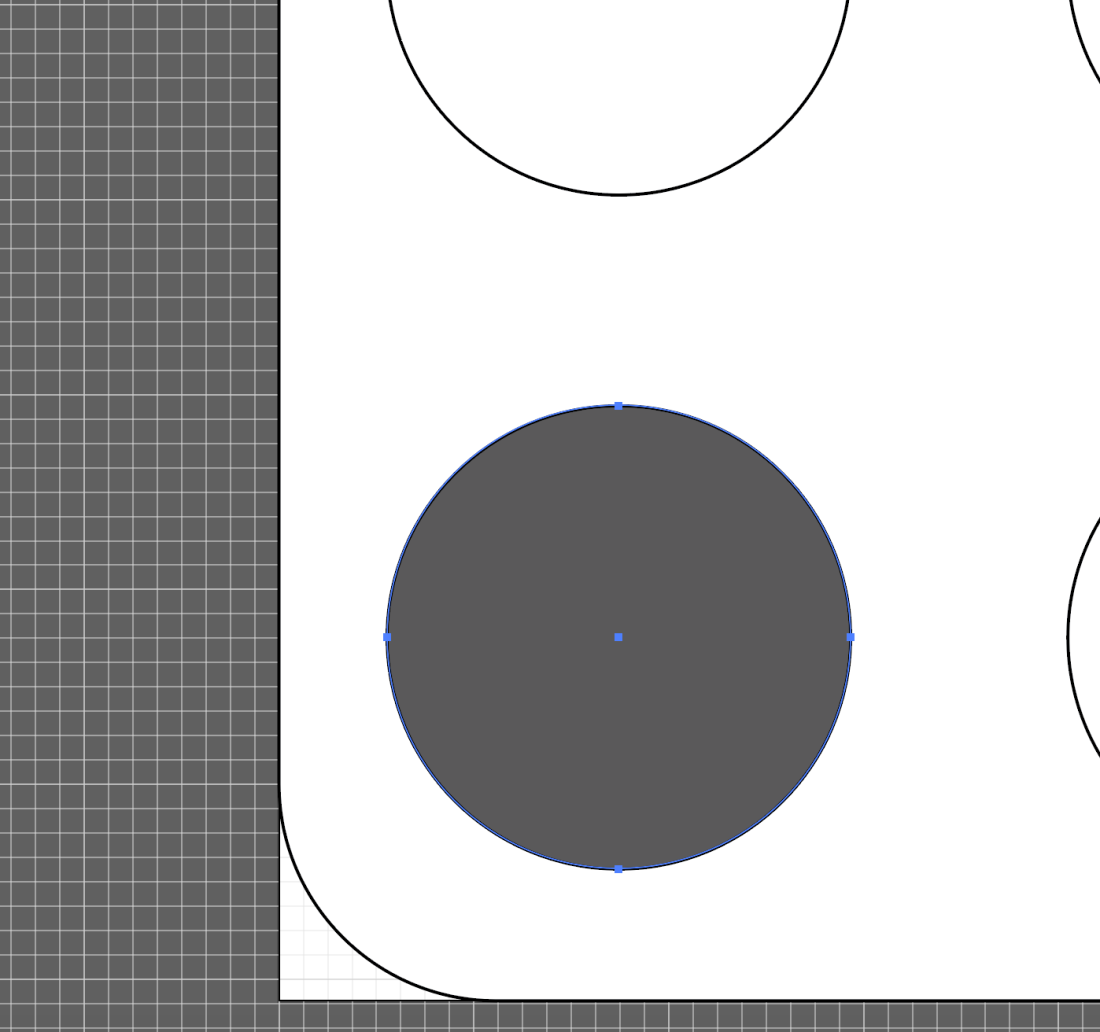
Once I had the dimensions set, I started to work on the shapes within my app, which I made using the Ellipse tool. The purpose of using the shape tool is to create the four hotplates on top of an oven and use the idea of a cooker to show that this icon is for a cooking app. So far, I feel that this idea is the best idea I have for my app as I have not seen any cookery apps which feature an oven, so I m hoping that my idea is going to be quite original.

Screen Shot 2017-05-01 at 13.53.01

To add in the next three circular shapes, I copied and pasted them in order to make sure each of my circles are of the exact same shape. Precision is something that I feel is vital to my app design as I want each element of my app to be equally aligned and to have an even structure. Placing my circles in an equal square shape is something that i found to be quite easy, as Illustrator guided my mouse into positioning the shapes equally.

Screen Shot 2017-05-01 at 13.53.41

On the right hand side of illustrator, I noticed a colour palette tool which I assumed would be to change the colours of different things on my design. Once clicking on this, I found the ‘Color Guide’ tab which allowed me to pick from different sets of colours that worked well together. I chose a grey colour to start off with in order to simply experiment with how this colour tool actually worked.

Screen Shot 2017-05-01 at 13.54.21Screen Shot 2017-05-01 at 13.54.25

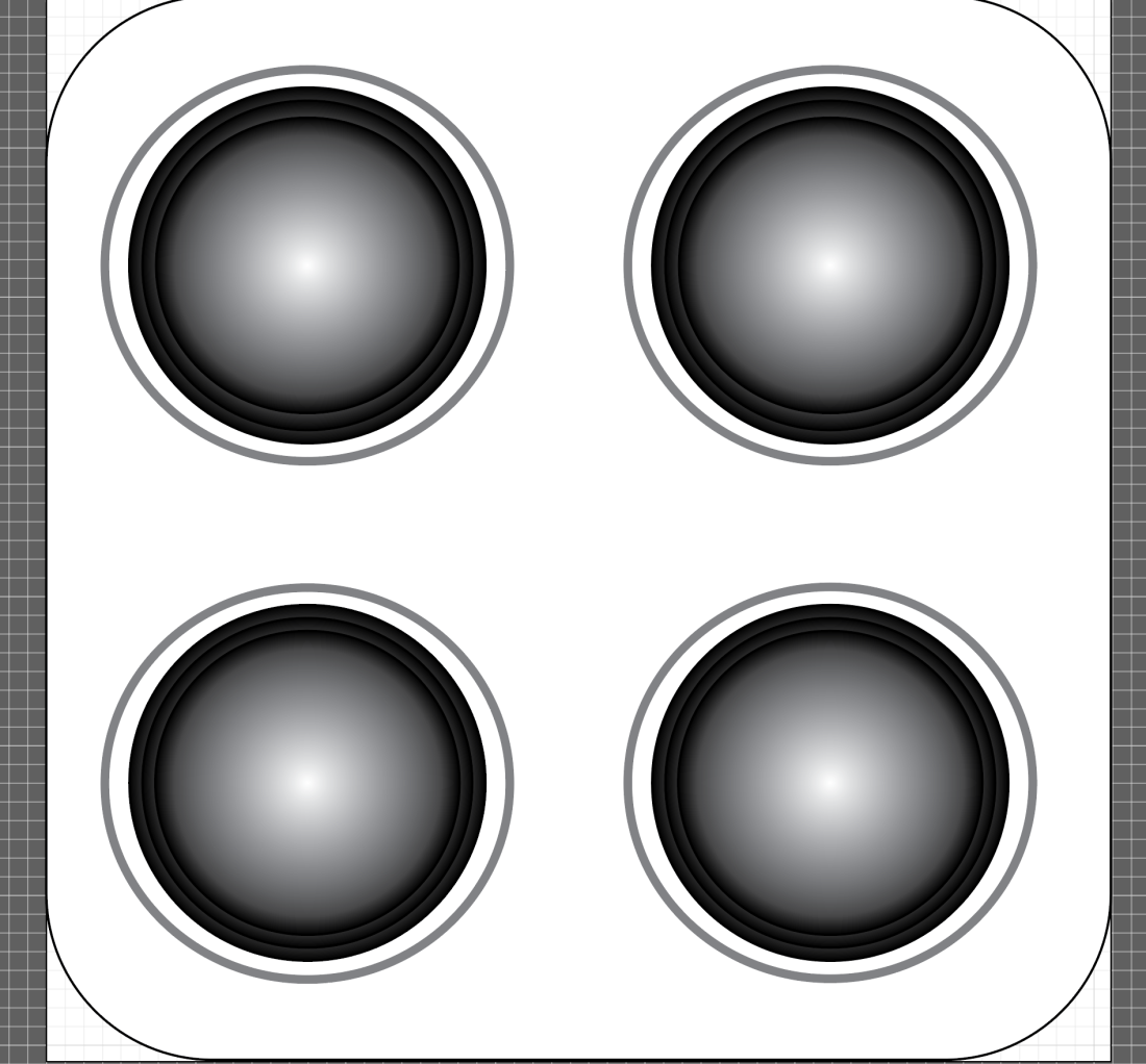
For further investigation into how to use illustrator, I have watched some more Youtube videos into using colour on Illustrator, and found that there is a gradient tool which allows me to create less of a flat colour. I have applied this to my circular shape and I am very fond of the effect, and therefore feel that this is something I will be doing more within my design. I additionally feel that gradients are something that are very effective within app icon illustration as Julian Burford uses multiple gradients in his app icon design to lessen the flatness of the icon. This has allowed me to understand how to make my design stand out further, and will hopefully reduce its flatness. Screen Shot 2017-05-01 at 13.56.35

After feeling that the gradient has not helped reduce the flatness in my design, I decided to duplicate the circles placing one on top of the other in hope to make them jump out from the page. I additionally feel that the dark circular rings around the edge of the circles will help my design appear more like a set of hotplates, as hotplates are known to have circular rings within them. Once applying and duplicating the circles in order to achieve my desired effect, I feel that due to the grey colours I have used, my app icon so far has little resemblance of a cooker, or hotplates, and therefore my design is not going to plan. I believe despite the grey and black colour scheme not helping, my design overall is not effective and the dullness to it makes it quite unappealing. So far, the design does not fit the brief as it does not appear anything like a ‘crazy cooking’ app, as it has no sense of craziness, and is overall hard to understand what the design actually is.

This problem is something I feel will be hard to overcome, as it has made me question my overall idea for the design, as it so far is not meeting the brief. To get over this, I feel I am going to have to reconsider my design and perhaps change the appearance of my app icon quite dramatically.

Screen Shot 2017-05-01 at 14.04.42Screen Shot 2017-05-01 at 14.06.50

Due to feeling my previous idea was too flat and boring for my icon, I decided to take a different approach, particularly using my research to inspire me. Julian Burford, a designer of some of the apps I looked at for research used more of a three dimensional approach to his icon designs and this is something I was very fond of. Due to this, I am going to use a similar idea to his, by making my design three dimensional. Pictured below is Julian’s app icon.

shot_1299519527.png

Screen Shot 2017-05-01 at 14.20.52Screen Shot 2017-05-01 at 14.20.57

I started out by using basic lines and rectangular shapes to build up the intended shape of the cooker. I used these shapes and lines in particular as they are parts in Illustrator that I am familiar with using due to having used them in the first attempt of making my icon. At this stage, I believe the design to be going according to plan, but have also encountered a slight problem. To create a one sided rounded rectangular shape, used for the bottom section of my oven, I found it incredibly difficult to construct using the line and arc tool. The part I found tricky about this was joining the arc and the lines together, as at the joining point the lines did not fit together smoothly, which makes my design look unprofessional. To overcome this I feel I will have to be more precise with my use of lines and keep readjusting them until I make them all fit together neatly.

Screen Shot 2017-05-01 at 14.23.47

In the above screen shot I have managed to adjust the lines to make them fit together in a neater way. I did this by using the selection tool to drag each end of the lines and resize them to shorter lengths.

Screen Shot 2017-05-01 at 14.23.54Screen Shot 2017-05-01 at 14.31.22Screen Shot 2017-05-01 at 14.35.18

For the next step of my design, I needed to make another compartment for the bottom of the cooker in order to make it close to the real picture. I started to do this by using the rounded rectangle tool to draw in the shape of the compartment. Once I had done this, I needed to find a way in which to straighten out the top of the shape, to make it fit with the straight lines shown above it. My first attempt at doing this was to use the eraser tool in order to erase the line. This was something which appeared to be a lot harder than I had imagined it to be. When using the eraser tool, I found that it did not erase the line but instead pushed it into the direction that I was pushing the eraser in, which ultimately made my once straight line quite jagged. Once this did not work, I looked within the tools under the eraser section and found the knife and scissors tools, both of which I felt could possibly help to remove this line. After being unsuccessful with both of these, I found that removing this line was not going to be as easy as I had hoped it would. I feel my instinct for using the rubber tool to erase the line came from my experience using Photoshop, and knowing that in this program the eraser tool erases pretty much anything I would like it to. Because of this, I feel I have a lot more learning to do in illustrator.

The reason behind wanting the edges of my rectangles to be curved was mainly down to the exploration of Julian Burford’s app icon illustration, as he frequently used rounded rectangular shapes, and I feel that they give his icons a soft appearance, making them quite pleasing to look at. Therefore, I don’t want to give up using the rounded rectangle tool, despite my failures with it so far.

After continuous exploration into the eraser, scissors and knife tools, I figured that I was approaching the line removal in the wrong direction, and therefore decided instead of using a set shape, I would go bak to using the line and arch tools to create my intended shape. This took a while, but I am pleased with the end result. Screen Shot 2017-05-01 at 14.37.40Screen Shot 2017-05-01 at 14.38.22

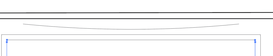
Whilst familiar in using the line tool, I continued to use it to make further shapes on my cooker. Above you can see that I have used the line tool and then arched it to create a handle shape on my oven. This did not take long, and is something I feel has worked successfully.

Screen Shot 2017-05-01 at 14.43.07Screen Shot 2017-05-01 at 14.46.31Screen Shot 2017-05-01 at 14.49.43

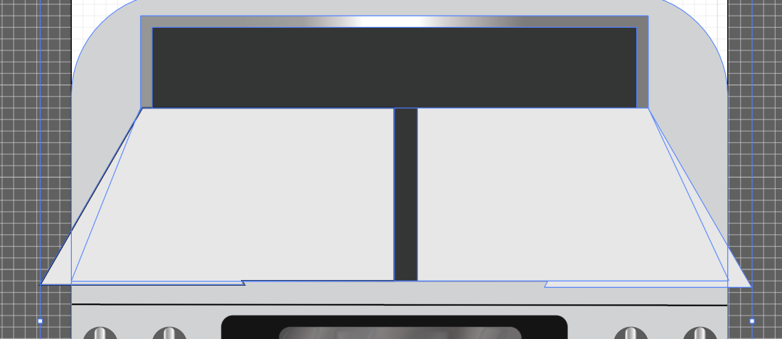
In the next three screenshots I have started to build up the shape of the oven using the line tool, rectangular tools, and Ellipse tool. At this stage, I am happy with how my app icon looks and feel it is starting to look how I wanted it to, with it becoming quite clear that it is an oven. Some of the lines I have made thicker than others to bring forward sections of the cooker from the background and into the foreground. I feel that so far my design lacks links to other illustrators work who’ve influenced me, and to make this link stronger I could start to explore some other illustrators work in order to gain influences for my app icon. Despite this, I feel that influence from Julian Burford’s apps are particularly helping me in this process, as his use of three dimensionality is something that has driven my ideas from the start of this project.

Despite being pleased with how my app is beginning to look at the moment, I am concerned about the negative space around the cooker as my main design does not fill the entire space of the app and this could be one of its main weaknesses. Each app I have looked at for my research has a full appearance, or even areas of negative space around the main design. To overcome this problem I believe I am going to have to think more carefully about composition, by either finding something to fill the negative space, or allowing a more even distribution of it.

Screen Shot 2017-05-01 at 14.55.20Screen Shot 2017-05-01 at 14.59.22

To continue working on my design I have decided to build up the different areas of colour within it, in an attempt to see what the cooker will look like when filled in with colour. I started off my just using the colour tool, which I found earlier at the right hand side of the page, and filling in a shape on my design. Once I had done this, I found the colours to be very flat, and felt that they needed something to push them from being just a flat colour. This is when I remembered about Julian Burford’s use of gradients, and decided to apply one to my design.

When applying a gradient, I noticed a ‘style’ selection at the top of the page, and decided to explore this further. I found that this allowed me to set my colour to a particular style, and so I chose an embossed effect to hopefully bring my cooker out of the background of my piece. Once setting this effect on my design I was particularly happy with its outcome and deiced to keep this effect as it made my design less flat. I feel that due to this I will be using the ‘style’ icon more in the creation of this app icon.

Screen Shot 2017-05-01 at 15.01.42Screen Shot 2017-05-01 at 15.04.10Screen Shot 2017-05-01 at 15.11.59Screen Shot 2017-05-01 at 15.34.26

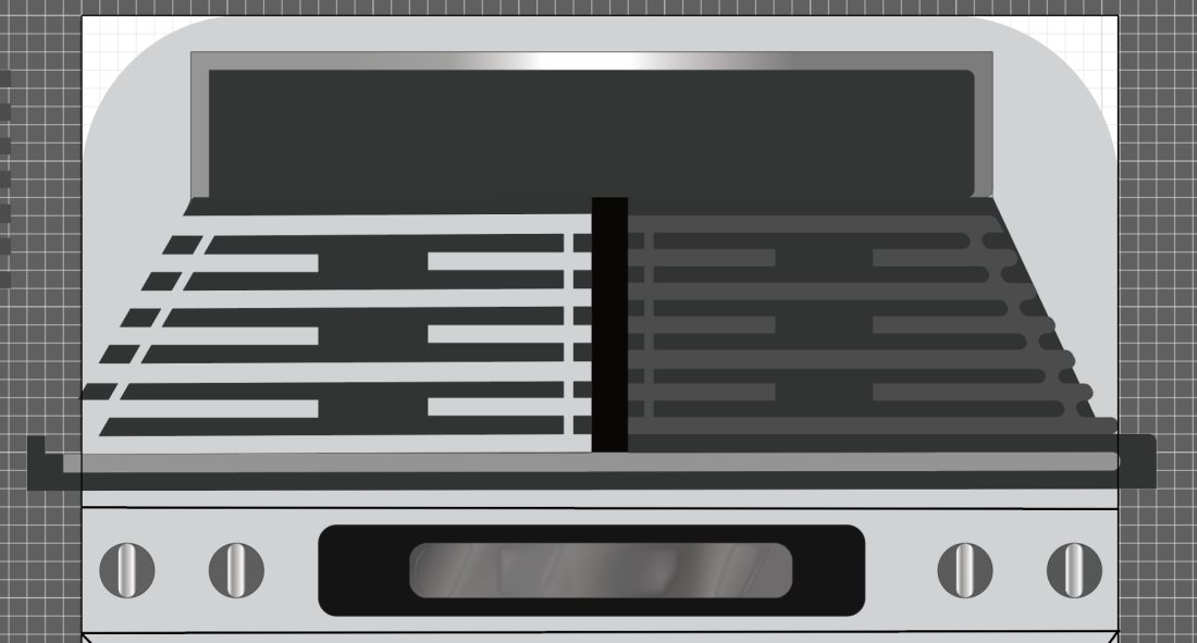
Shown in these next screenshots is my discovery of further textures, which I have made relevant to my design. I used a metallic-looking texture to create some of the shiny textures within my oven and then used the embossed effect to further bring out sections on the oven. I additionally fill in further areas of the oven by creating rectangular shapes and blocking them in with plain black colour. This has immediately started to give my oven a fuller appearance, and I am pleased with the result.

Screen Shot 2017-05-01 at 15.41.08

This screenshot shows the learning process I took to understand the shaper tool, which I learnt was the solution to a lot of the problems I have been encountering along the way. In some of the you-tube videos I watched, the shaper tool was frequently mentioned but was something I chose to ignore due to believing my lack of skills in illustrator would make this tool quite hard for me to understand. I learnt that the shaper tool allows me to join together, and remove parts of different shapes which allowed me to create a custom shape, closer to the one I wanted,  and through ultimately an easier way than to keep using the line and arch tools.

Screen Shot 2017-05-01 at 15.47.25Screen Shot 2017-05-01 at 15.49.27

The above two screenshots show how I have used the shaper tool to create more custom shapes, which could then be filled with colour, which was a lot easier than using the line tool. Once I had placed all the individual shapes, I joined them to make them one. This allowed me to move the shape as one. I am particularly happy with my illustration at this point as I feel that it is coming along nicely. Experimenting with the shaper tool has been very beneficial to me and I am therefore pleased with allowing myself to explore the too;s in this program further.

Something I feel which is not working so well at this point is the colour scheme of my design, as I feel it does not resemble the craziness that was intended, and this was a key part of the brief. Despite the colours clearly resembling an oven, I feel that they are incredibly boring and the dullness does not make the app icon appealing. I am hoping that this is something I can develop and change in the latter stages of my icon development.

Screen Shot 2017-05-01 at 15.54.54

Now I am starting to build up the shapes on top of the oven, in a bid to make it more detailed and less boring. I have used the rectangular tool to make the long thin rectangles on top of the oven, and using the shaper tool I then hope to connect them, making them one shape and allowing me to change the colour the colour of each section at the same time.

Screen Shot 2017-05-01 at 16.03.41

Capture76

Once using the shaper tool to connect each segment of the shapes I placed the grid shape I had made on either side of the oven, and started to change the colour of it (seen through the light grey colour). However, whilst experimenting with colour I noticed that one of my grid shapes had changed slightly and one end of the grid had changed into a rounded rectangular shape. This is something I was unaware of happening and am completely unaware of how I did this without realizing. This is when it became even more evident that I was very unfamiliar in using this program. Despite not knowing how I had achieved this effect, I was very happy with it and believe that the less harsh edges would made the design have a softer appearance, and is something I am quite fond of.

Screen Shot 2017-05-01 at 16.06.50Screen Shot 2017-05-01 at 16.09.42

As I was so fond of the rounded rectangular ends of the rectangles, I decided to delete the harsher looking grid and duplicate the rounded one. Using two of the same grid gave my oven a more even appearance, and I feel this is one of the successes in this part of the design.

The part I intend to work on next in my design is developing the crazy aspect within it, making it fit the brief further.

Screen Shot 2017-05-01 at 16.13.45Screen Shot 2017-05-01 at 16.10.59

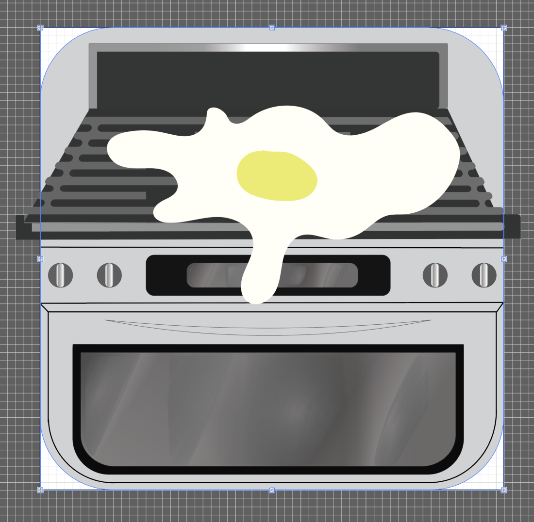
After feeling my app was not ‘crazy’ enough, and therefore did not meet the brief well, I decided to add some elements to it which may make it crazier. Firstly I tried adding some food splatters to the oven, implying that the person who was cooking (the chef) has crazy attributes. This effect I quite liked, and felt that elements of craziness were brought through it, yet I still wasn’t sure whether this would be the best way in representing ‘crazy cooking’. I therefore continued to experiment further, adding food into my design. Doing so, I added a large egg on top of the cooker, which I placed over the grid and as if it were dripping down the front of the cooker. Without a frying pan, and being so large, I felt this brought a sense of craziness to the design. However, this crazy fried egg idea is something I believe to look immature, and ruin the design. I therefore feel that this is neither suited to the look I was going for.

Both the food splatters and fried egg were custom shapes I had drawn out in illustrator and adapted the colours to suit the design.

Screen Shot 2017-05-01 at 16.37.10

After working out that placing things on the top of my oven was unsuccessful, I have decided to move onto looking and developing the colour scheme further. I started with the grid on top  as I felt that this merged in with the cooker ans when reduced down to the size of an app, would not be very visible. Looking at the colour scheme of KillerIcons shopping trolley App, I decided to use a similar colour scheme as I felt the colours in their app worked well as they made it stand out.

I feel that adding a yellow colour to my design is something which has worked incredibly well at brightening the design up. I additionally feel that due to the yellow colour being used on the top of the oven, a sense of craziness has come through as this is rarely a colour associated with ovens, giving it a sense of craziness. Despite this, I believe that my design is still quite dull, and feel that if I were to add more yellow into it, it would be a lot more vibrant, and pleasing to the eye.

Screen Shot 2017-05-01 at 16.38.41Screen Shot 2017-05-01 at 16.40.57

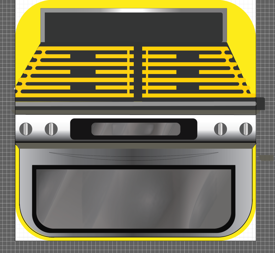
In the above screenshots I have added more yellow to my design, and changed the original yellow colour I had used to a slightly brighter yellow, to make my design stand out once it is reduced down to the small size of an app icon. I am incredibly pleased with my icon at this stage and am very happy with how the design is coming along. I now believe it is starting to meet the brief a lot more than the previous stages as I am quite confident that it resembles ‘crazy cooking.’

I feel that the yellow colour should draw people to my app in particular, making its colour scheme one of its main successes. I additionally feel that the colour scheme works well due to its simplicity, as over-complication of colours in the design may make it seem crowded and too busy. Therefore, using a simplistic colour scheme is something I feel has made my design very successful.

One of the weaker aspects of my design at this stage is the curved handle which is placed just above the the rounded rectangular shape on the lower half of the oven. The reason I believe this to be a failure in my design is because it is incredibly hard to see, and due to it not been filled with a colour, it will disappear when scaled down to the actual size of an app icon. I additionally believe it does not resemble a handle in the slightest due to the pointed ends of it, which seem connected to the cooker very unrealistically. To get over this, I am hoping to take out this handle, and replace it with a solid rectangle, which should hopefully fit in better with the rest of my design.
Picture1

The app icon featured above is the icon designed by KillerIcons, and i what influenced me when thinking about the colour scheme for my illustration. I feel that the dark colour of the brown contrasted against the yellow worked particularly well to make the app stand out, and therefore used this idea of having yellow to back up the dark greys and blacks in my design.]

Screen Shot 2017-05-01 at 16.44.52I have reviewed my app icon so far and came to the conclusion that something was missing. I was happy with the top half of the oven as felt the yellow grid gave it a nice balance between grey and yellow, yet felt the bottom half of the oven still seemed quite dull, and due to this I believed something further needed to be added to it. Inspired by one of the apps I looked at for my research, I decided to add some oven gloves to my design in order to make the front of my cooker seem less boring. These I plan to hang over the front of the cooker.

To begin making my oven gloves, I  used the rounded rectangular tool, and set the corner radius to quite a high value, in order to create the right amount of ’roundness’ for the oven gloves. I connected the two different shapes using the shaper tool.

Screen Shot 2017-05-01 at 16.45.20

Now I have made the basic shape for my oven glove, I felt it looked quite stiff and did not resemble a realistic oven glove shape. Therefore, I went on to use the warp tool in an attempt to shape the oven glove to a more accurate shape.Screen Shot 2017-05-01 at 16.54.41

This is the result.

In this screenshot it additionally shows that I have made another rounded rectangle and placed it beside the original oven glove, and then used two slightly different shades of red to colour both of the designs with. The purpose of the second rounded rectangle was to place behind the main oven glove, and to place it as though it is hanging over the handle on the lower half of the oven. This is something I intend to do once my oven glove is complete. At this stage I still feel that this element of my does does not resemble oven gloves clearly, and have a certain sense of flatness to them which will need to be developed upon.

The reasoning behind changing the oven glove to a red colour was based on  the success of the red oven gloves in one of the apps I explored for research. In that design, I felt the red to be quite  striking and eye catching colour, and wanted a similar effect to be seen in my app. The second rounded rectangle shown has been coloured in a slightly darker red s I am hoping to place it behind the main oven glove, and the darker colour should show the idea that it has a shadow over it; due to it being behind the main oven glove. This is a way I have tried to make the design seem quite realistic, and feel that the idea of shadowing will enhance my design.

Screen Shot 2017-05-01 at 16.56.59

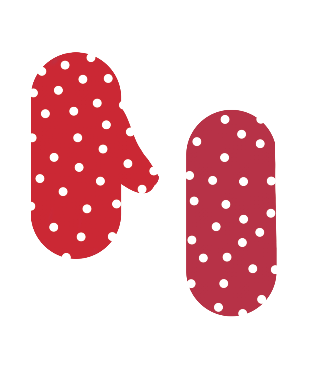
In the screenshot above, it can be seen that I have added white polka dots to my design, inspired further by the oven glove design I explored for research. As I felt this would be a fairly time consuming task to do in illustrator, I dragged my oven glove shapes over to Photoshop, and used the pen tool to draw in the polka dots. This was a quick and easy way of placing these dots in my oven glove. I still feel that the oven glove appears quite flat and in the further stages of tampering with this aspect of my design I hope to build up more shadowing on the oven gloves by using the pen tool and a dark colour on Photoshop.
Picture2

Above is a picture of the oven glove app I have been referring to, that has inspired me greatly in my design work.

Screen Shot 2017-05-01 at 17.15.57

I firstly tried placing the glove as though it would be hanging from the lower half of the oven. To do this, I have found that I will need to resize and adapt the shape of the oven glove to make it fit. Before experimenting with this idea further, I intend to try another positioning.

Screen Shot 2017-05-01 at 17.18.48

Here I have experimented with duplicating the oven glove and placing them as though they re like hands. Looking at the oven gloves like this I feel is something I do not like, and with the oven gloves floating as they are in the screenshot, it almost makes the oven look comical, as the gloves look quite random. Due to this, I feel that going back to my original idea of placing the oven gloves over the lower bar of the oven is the way forward for my design.

Screen Shot 2017-05-01 at 17.30.15

Once I had added a slight bit of tonality to my oven glove, I experimented with placement of it on my app icon and then came to the conclusion of which placement worked best. I experimented with duplicating the oven glove and seeing whether two was more effective than one, and placing them on the top of the cooker and the bottom, to decide which worked best.

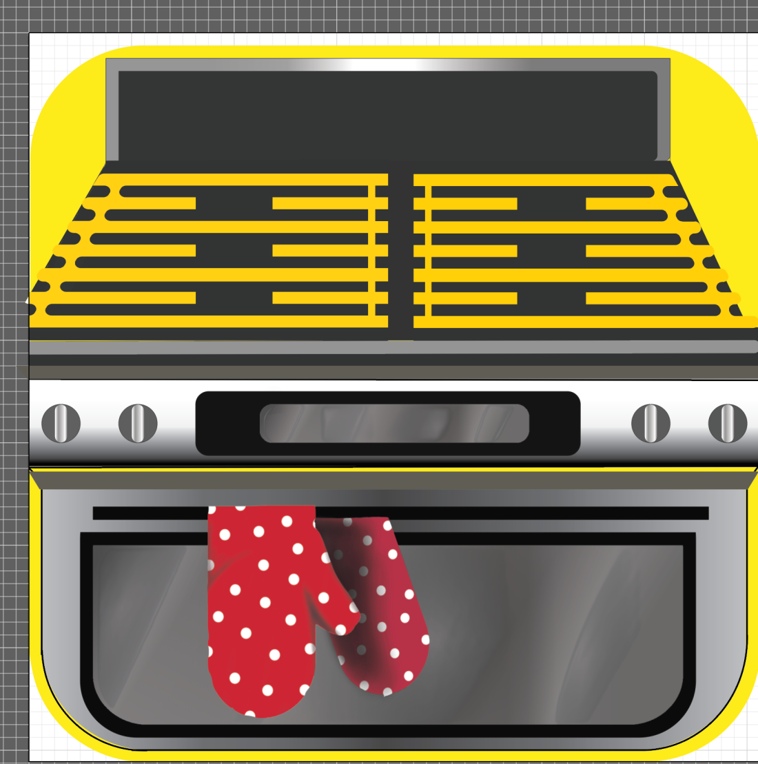
I eventually came to the conclusion that my oven glove looked best hanging over the handle on the bottom half of the oven, and therefore using the Shaper tool, I adapted it to fit here as if it were placed over the handle. I feel the red and white spotty appearance of the oven glove rally brightens up the lower half of the oven, and continues to add in elements of this craziness that Dan Lovell-Bray wanted.

Screen Shot 2017-05-01 at 17.32.36

The last step of my design process was adding in the title of the app ‘crazy cooking’. Despite not being compulsory, I felt that adding this into my app would help make it even clearer as to what the app was. In the above screenshot, it shows how I have written in ‘crazy cooking’ over the cooker. I drew in the typography rather than typing it to further imply this sense of ‘crazy cooking’, as the writing appears un-neat and slightly crazy due to this factor. However, despite hoping to show a sense of craziness in this design, I feel it is incredibly hard to read and this makes it un-successful.

Screen Shot 2017-05-01 at 17.38.51

This is another why I tried placing the typography, but felt that the random green rounded rectangle blocked out too much of the cooker, defeating the point of the whole design.

Screen Shot 2017-05-01 at 17.39.58

The last way of typographic placement I tried was putting the text within an area of the design. I was inspired by the app ‘My Recipe Book’ (designed by Cross Forward Consulting, LLC). Within their app icon they used a small element of typography which they placed on the knife design, and I therefore felt that due to this idea working well for their design, I may try a similar idea to see if it has an effective outcome. This is why I placed the text on the back of the oven, as though it were written within the design.

175x175bb.jpg

Once I had placed the typography within the design I felt that this idea worked particularly well and the typography fitted nicely in the design. This allowed me to come to the final stage of my design, and decide that my app icon was now finished.

FINAL APP DESIGN:Screen Shot 2017-05-01 at 17.52.19

Overall, I am incredibly happy with how my app icon has turned out, and despite it not being my original idea, I am very happy with the outcome. Now my app is complete I am able to reflect on the parts which I felt went well within designing it, and the parts which did not work so well.

The suitability to the brief is something I feel my app fills quite well, as the imagery used clearly links to cooking, with the occasional reference to the craziness that Dan Lovell-Bray wanted to be shown within the app icon. The main aspect of craziness comes through the colour scheme of the design, and the idea of having a half yellow oven to be quite crazy. The brief makes it clear that each element of illustration produced for Dan Lovell-Bray should be suitable for its purpose, therefore my illustration in this case needed to be suitable to be used as an app icon. This meant I had to think carefully about imagery size and colour, as app icons are very small so I had to take into consideration that this app is going to be reduced down in size. I felt if I were to use typography as the focal point for my app, a big risk would be taken, as the typography may be hard to read once sized down. Therefore the typography within my design is something I made less important, and I mainly focused on the design itself in order for people to recognize the app without having to read the title. I believe that overall my design fits the brief well.

I am very pleased with the colour scheme used in my design as I feel the bright colours draw your eyes to the app and make the colours very effective within the design. A part about the design I am less pleased with is some of the line work within it, particularly in the lower left hand corner of the oven, as the grey colour does not touch this line and makes the line appear put of place. However, this is not too drastic, and once the app is resized smaller, it is very hard to notice this.

Despite my reluctancy to use illustrator at the start of this project, I feel that using illustrator has been particularly beneficial to me as it has allowed me to gain knowledge into a program I was not familiar with. I feel that I have learnt a lot of vital skills which I will be able to use in my future design work.

My research is something which has additionally helped me greatly with this illustration, as it has allowed to to use various different influences from different illustrator, exampling some of the places my ideas have come from.

I am overall very pleased with my app icon and feel it has been a success. There has been a lot of failures throughout the design process I have had to overcome, but I feel I have overcome these well, and am looking forward to designing the next part of illustration for Dan Lovell-Bray.

Photos for my project

The six images below show the process of making a pavlova. I intend to base my recipe illustration around making a pavlova, and therefore feel that these pictures of the process are something which will help me understand the recipe further. The cooker image is additionally something I feel will help me greatly, as it could be used when making my app icon.


Unit 49 – Specialist Illustration using computer applications.

A famous chef, ‘Dan Lovell-Bray’ has decided to release a new cookbook called ‘Crazy in the Kitchen’. He is also launching a cooking app, range of ready meals and is giving an interview to BBC Good Food magazine. The celebrity chef is looking for a graphic designer/illustrator to design aspects of these projects. For this brief I will need to design:

  • An instructional illustration, illustrating the steps of one of his recipes from the cookbook.
  • A double page spread for BBC Good Food magazine that uses illustration to suggest his experimental ‘crazy’ style of cooking.
  • Either an illustrated app icon for his app ‘Crazy Cooking’ or a piece of illustrated packaging for his ready meal line entitled ‘Dan Lovell-Bray’s Crazy at Home’

The chef has said he wants the designer to use a range of media from scanned textures, illustrator shapes and pen tool, traditional drawings (perhaps in pencil or fine-liner) and Photoshop (Wacom Drawings). Through my designs, I must show the chef’s crazy style of cooking, and my design must be suitable for what it is used for.

I am looking forward to working on this brief as I feel I would enjoy illustrating things. However, I believe that this brief will challenge me, as I am quite unfamiliar in using illustrator, so feel this brief will test me.

4 FINAL OUTCOMES AND EVALUATION

Valentines Card

IMG_029618053163_1029433497189656_334020356_o

New Baby card:

IMG_0298IMG_0299

Birthday Card:

IMG_0297IMG_0301

Sympathy Card:

IMG_0326IMG_0327

I chose to make my sympathy card quite simplistic, and use a set colour scheme, which I feel has worked quite well. I additionally included a pearl on each of the butterflies, which adds an element of elegance to the card, giving it quite a professional look.

Final Evaluation:

When I first got the brief for this project I was not that pleased as I immediately felt that this project would be quite challenging, which it was. I found producing the cards very time consuming, and if rushed, the result appeared very unprofessional. The part I enjoyed most about this project was making the final cards, as not only do I think these are the most successful cards I have made, but they allowed me to bring all my ideas from my previous cards and research together to produce my final outcomes. Doing my research into different card types, I got the chance to develop an understating into how different materials can convey different emotions, followed by things such as negative space and colour. Particularly focusing on materials, I gained an insight into why softer materials are used for new baby cards, and things such as bright shapes and colours are used on birthday cards. It also gave me an understanding if how stereotypical symbols are used to represent each different event on each type of card such as balloons for birthday, hearts for valentines day and flowers or butterflies for sympathy.

With each card I produced I always made sure to follow the health and safety instructions I had set myself, and follow precautions when handling things like wire, craft knives or scissors.

I completed research looking into the use of media and materials by different artists and designers and I found this to be very beneficial to me throughout my project. It allowed me to explore how different materials can be used in ways which convey different messages and emotions through the quality of the material. This informed me further when it came to making my final pieces, as based on my research and experimental cards, I was able to explore materials that would show relevant emotions to the card. I feel I enjoyed using coloured card the most, as I found it the easiest to work with, and I felt this material had a lot of possibilities, as I was able to cut, fold and manipulate it. I also enjoyed working with watercolor paint, as I found this to be quite an unpredictable medium, as the paint flows in a variety of different directions, and dries darker in some places than others, creating quite interesting effects. The materials I found hardest to use would be cotton wool and wire. I found it hard to use cotton wool in a different sense to how I found it hard to use wire, as I found the wire incredibly tricky to stick down on my cards, yet the cotton wool was easier. I am unfavorable of the use of cotton wool as I am not fond of the feel it has to it, and therefore found hard to pull and assemble how I wanted it, as I really do not like the feel of it. This is why I did not use too much of it. Using the wire to make a paint roller on one of my cards is a way I feel that I used the material in a creative way, as it involved sticking the wire flat to the card, something which was not easy at all. Another creative way I used materials I feel is through using photography for the grass element of my final birthday card. I feel using a photograph allowed my design to have an element of realism to it, and it is something that I had not thought of doing in my previous card designs.

I feel that overall my cards clearly represent the feelings and emotions I wanted them to, and my use of materials was effective based upon the choices I made. My favorite card out of the four I have made is the Valentines card, as I feel that this is the best card at conveying the intended emotions, and is effective due to this. I additionally feel that using a wide range of materials helped this design to convey these emotions greatly, as each element of material shows a different emotions, making the card seem exciting. For example the flowers show a traditional sense of love, whilst the small gems included perhaps show more of a elegant love, giving the card a sense of deep worth.

My least favorite card I made is the birthday card, because I feel  it is the least effective in conveying emotions of a birthday, and believe that some of my birthday experimental cards convey these emotions better. If I were to improve this card, I would add further birthday imagery, and use rainbow colours to evoke a further sense of excitement, like I have done in my refined cards.

From this project I have learnt the different ways in which different materials can convey emotions, and how when different materials are together, they can convey an entirely different emotion or feeling. I feel I have benefited from this project as I have a wider understanding of how hard it is to convey emotions in certain card types, and feel if I were to do a project like this again I would have a lot more knowledge of how to go about completing it.

Personal Research 1


In this congratulations card, not a vast range of materials have been used which is something I feel gives the design a few negative qualities. However, I am particularly inspired by the simplistic form that this design has, and despite its basic use of materials, I feel that the designer has used the materials with sophistication to suit the purpose. From looking at this card, I feel it mainly uses plain, and coloured card, along with pens, and perhaps water colour paints, to brighten up the design. I believe that watercolour paints have been used to create the background of the design, which has been done well, as the use of these paints would allow the designer to create an equal gradient effect for the sky. Additionally, the light colours of the paint evoke a light-hearted, calm effect, giving the sky of the design a soothing and still atmosphere. The colours of the plane are suited to match the background, yet are slightly brighter colours, which make the plane the main focal point of the design as the colours overpower the background. The typography in the right-hand lower corner of the card suggest the design is celebratory, as the typography reads ‘congratulations’, suggesting celebratory emotions should follow. However, from the colour scheme used within the design I feel that this celebratory sense is not clear within the design, as the mixture of blues, oranges and yellows alludes to imagery of a sunset, or calm sky on a sunny day. This calming feeling is something I feel is not very congratulatory, and I believe if a wider colour scheme of brighter colours were to be used, the card would demonstrate this celebratory emotion in a better way. Despite this, as the general message of the card is ‘congratulations’, and I am unsure as to what the occasion to be to be celebrated is. The imagery of the plane in the sky suggests the card is for someone who has passed a pilots flying test, and along with the message ‘the sky is the limit’ (on the pull out tab of the card), makes it seem as though this card would be suited to a new pilot. However, the phrase ‘the sky is the limit’ may be used in a metaphorical way, implying that the receiver of the card has endless possibilities due to the success they are being congratulated for.

A clever use of composition is used in this card as the main focal point (the plane), moves across the center of the card and does not stay in one set position. This allows the whole proximity of the card to be important, as each element of background will be looked at when the plane travels across it. As the plane travels across the middle of the card, it draws your eyes in an upwards motion, across to reveal the message on the pull out tab. This additionally shows a way in which the most successful materials have been used, as the line in which the plane travels through is neat and small, allowing it to glide across the card smoothly, and further implying a sense of success. The plane itself is something that works well from this card material, as it is strong and sturdy, making it well suited to be a moving part of the card.

Another thing I feel that does not work that well on this card when portraying celebratory emotions is the typography, its small format gives it less of a bold impact, and the de-capitalisation of letters makes the message appear quite boring, and unimportant. In order to create a wider sense of celebration, I feel the letters would need to be enlarged and perhaps putting them in capitals may make the message seem more important to the card.

I have chosen to look at this card as part of my research as I believe the pull out aspect it has to it is something which works incredibly well, as makes the card more exciting. I feel that allowing the plane to move gives the card a sense of excitement, and a joyous emotion, yet the lack of bright colours and exciting materials particularly limits the design. I am hoping to make a card inspired by this design, yet adapting the materials to suit the purpose of my chosen card type.

air

Personal Research 2


This is the second card I looked at as part of my personal research. It features a panda holding a balloon with the message ‘celebrate your special day’ alongside it. I feel that this card used quite a few different materials within it, and from looking at the card I can infer that these are; sequins, card (coloured and plain), string, pen, and plastic. Using such a wide range of materials is something I feel really emphasises a celebratory feel, as it brings the card a sense of excitement, as there are so many different elements to this. The materials appear to have been used in a sophisticated way, as they do not over complicate the card, but they have been designed and put together with a neat sophisticated sense, paying particular sense to focal point, colour and scale.

Despite a wide range of material use the card itself is something which appears quite simple. The focal point is centred on the panda and balloon, with the use of the string drawing your eyes down from the top of the balloon to the little panda grasping the lower end of the string. This placement of the balloon and panda is something which works well within the design, as it is placed on one side of the card, allowing a large space for the typography as it dominates the other half. The typography uses two different typefaces, which I feel is incredibly successful on the design. The first element of type is showing the word ‘celebrate’ which is in a fairly large and noticeable font size, with the typography itself being a curled font, giving it quite a classy appearance. This curled font allows a joyful emotion as it appears fun, yet sophisticated to suit the rest of the card. Following this type is the words ‘YOUR SPECIAL DAY’; this is shown in a bold, capitalised, block font which fits neatly under the word ‘celebrate’. The bold font and capitalisation of these few words makes them appear quite direct to the audience as they emphasize the idea that it is ‘YOUR’ ‘SPECIAL DAY’.

I am particularly inspired by the use of sequins in this card design, as I feel it adds a fun sense to the card, overall making the design more exciting. Based on this idea of using sequins, I am hoping to create a card with a similar sense, as I am particularly fond of this design.

lolk


Personal Research 3

The use of materials in this card particularly inspired me for my cards, and the overall card design is something I felt would be incredibly effective in my project. Despite having a simplistic appearance, this card uses four different materials giving the design interesting and unique qualities. From looking at this card, I believe that the main materials that are used are coloured card (which appears to have a surface texture to it), plain card, wire, and some kind of fluffy, feather like material (perhaps part of a pipe cleaner). Using this range of materials allows the card to portray a range of emotions. For example, the soft texture of the pipe cleaner evokes soft and caring emotions, and along with the pink colour of it, almost examples a sense of love. In contrast to this, the wire has more of a harsh appearance, as it is stiff unlike the pipe cleaner, and almost shows a study and secure sense. Mixing these contrasting emotions together represent the moving house situation to have more than one emotion. The pipe cleaner may demonstrate the love felt towards the new home, as the person falls in love with their new property. Along with this, the sturdy sense of the wire perhaps gives the person reassurance that their new home is secure, and safe for living in. These particular materials take a lot of inference and depiction into, to get an idea of the emotions portrayed through them as they are laid out very simplistically on the front of the card. I feel using contrasting materials (in this case hard and soft), to be something which works incredibly well on the card, as it gives it an interesting appearance, yet due to the simplicity of the card I believe that the materials do not deliver the message well, or do the card much justice. In the process of moving house, I feel that a wide range of emotions would be felt, from feeling anxious about the move, to extreme excitement of getting a new house. This exciting sense is something that is not shown well within the card, as the simplistic sense almost gives the idea of moving more boring connotations. The card is not bursting with colour, evoking excitement, but is instead fairly plain with the use of only white pink and black.

Despite the previous points I have made, seeing the card to be quite simple and boring, I feel having another look at the card has allowed me to view it from a different perspective. The majority of the card is made from white card, which is seen for the background of the card and design itself. Over the top of this, slightly textured, pink card has been cut and stuck down, as though it is paint which has been painted over the white walls of the property. The use of white card, seen as negative space, is something I feel could be done deliberately; alluding to the fresh, clean walls of a new house. Therefore, when taking this second look at the card, I believe the main idea of it was to show the new beginnings that can come with a new property, as the walls are painted with a pink colour, as if the person is decorating the house metaphorically with love, or perhaps items of theirs that they love. In this case, I feel the composition, and placement of materials on the card is something which works incredibly well in demonstrating this.

This card has made me think very carefully about designing my cards, as although it does not fit under the four themes of the cards I am planning to make, it has allowed me to look further into materials types and how they are used to demonstrate particular emotions on the card. It has additionally allowed me to understand the use of negative space further, and how it works in effect on some particular card types. If adapted, I feel that this design is something which would work well for a birthday card, as combined with bright; dramatic colours may work well to explore a celebratory emotion.

home


Personal Research 4

This Valentine’s card explores a geometric design which is what drew my eyes to this particular card. As well as this, the card only uses three material types, which both contradict the types of materials I would expect to be used to represent the loving emotions that come with Valentine’s Day. I feel that three of the main emotions that come with Valentine’s Day are love, care, and joy. To convey these emotions, I feel materials such as soft pink fabrics, and bright colours would be used, demonstrating this soft loving and joyous feel of Valentine’s Day. However, neither bright colours, nor soft fabrics are used within this design, but in fact, the opposite. The three main material types that are used within this card is card itself, wood, and string. Both card and wood are incredibly sturdy materials, usually both with hard or harsh edges. Unlike these, the brown string is something which is able of manipulating, but the rough surface texture to it is something which fits in nicely with the use of wood. The designer of this card has used the strong materials as a theme throughout the card, as the patterned background of the card shows geometric heart shapes, which equally appear as stiff as the materials used. Using this as the main theme throughout the design shows an alternate take on the regular light-hearted imagery of Valentine’s Day

sj

COMPARISONS OF VISUAL LANGUAGE ACROSS CARD TYPES

Looking at a variety of different cards has helped me understand how different emotions are conveyed through the use of different medias and materials. I feel that the more celebratory cards have a wider colour scheme, using colours which spark a happy emotion. In comparison to this, I found that the sympathy cards use more of a muted colour scheme, an colours which derive compassion, and are more thoughtful in what kind of emotion is portrayed in the design.